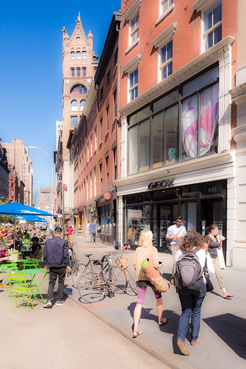
Great storefronts mean vital places
It may come as a surprise, but few things in walkable places are stronger predictors of the vitality of a town or neighborhood center than the quality of its storefronts. Centers in the US normally gather around a Main Street or square. European centers often gather around a plaza, place, piazza, High Street or (again) a square. But whatever it’s called and however it is shaped, the life of the center is fueled more by the quality of its storefronts than by any other factor. Auto-dominated commercial strips, by contrast, are fueled most by two things: their tall pylon signs, and tall architectural elements such as towers at the corners of mid-box buildings which are designed to attract attention quickly from motorists speeding by. Big-box buildings, of course, are their own massive billboards. But back to walkable places ...

Go into any neighborhood and walk down a primarily residential street, and you’ll likely find relatively few people walking, even if it’s after work. But good neighborhood centers are often thronged with neighbors after work. A few of the people on the residential streets are walking to a neighbor’s house, but most of them are walking to the neighborhood center. The primary job of the residential street is to collect them and to entertain them enough along the way that they don’t get bored before arriving at the neighborhood center.
Think of the primarily residential streets as the opening act to the main event that is the town or neighborhood center. Streets leading to the center should have enough Walk Appeal to be interesting so that people keep walking; the center itself should be positively entertaining in order to entice enough people that it becomes a vibrant place.

Entertainment begins at the storefront, and the reason why is primarily geometry. As you walk along the sidewalk, the views that change most quickly are those into the storefronts beside you. Every five to eight seconds, you can walk past another shop, with its unique selection of wares on display. Entertainment is the opposite of monotony, and changing the view frequently is essential to avoiding monotony. All of the places shown in this post are in metropolitan areas that have districts built of larger buildings, but fewer people walk there except at starting time and quitting time of the offices because large office buildings are much less interesting because it can take a minute or more to walk by some of them.

People don’t come to the center solely for an entertaining walk, of course; they usually have a reason to visit one or more of the shops. So uses do matter, and the the more frequently-visited businesses like a grocery or a third place (coffee shop, bistro, cafe, pub, or restaurant where you can bring your laptop or tablet and hang out for awhile) draw people more frequently than a shoe store, for example. The difference is that if the walk is boring or the storefronts in the center are boring, they’re more likely to drive to the shop from which they need something, pick up the item, and drive back home whereas with great Walk Appeal fueled by great storefronts, they’re more likely to walk and then stay awhile once they get there, benefiting more businesses.
We’ve already talked about frontages in general; now let’s look in detail at the storefronts that line those frontages. And fortunately, there are a few simple steps for making them enticing. Storefronts are made up of up to five parts. Three are essential and two are optional. The building face is essential, and includes the windows, doors, doorways and other architectural elements. The interior display is essential as well, as a storefront where you can’t see what is being sold is pointless. Signage is also essential. Many storefronts have some sort of shelter, such as an awning, gallery, colonnade, or arcade. Some storefronts include exterior seating for food or drink service establishments. We’ll look at the essential elements of a storefront that occur on the sidewalk level in this post. The following are rules of thumb for each:
Windows and transoms

Storefront windows should be single-lite clear glass to best display the wares inside. Divided lites may be used only when the items for sale are substantially smaller than the panes, so you can get an unobstructed view of things in the window. Storefront windows may run the entire height of the glazing, or may be capped with transoms. Transoms may have divided lites because the muntins diffuse light coming into the shop, bathing things within the shop in a softer light.
Glass percentage

The best storefronts are 65 percent to 75 percent glass at eye level. Less glass is boring, because you can see less of the interior. More glass is also boring, but for a different reason: the closer you get to the 100 percent glass of a butt-glazed curtain wall, the less interesting the wall becomes because more and more architectural elements like piers, pilasters, casings, and sashes must be removed. And when walking down the sidewalk beside the curtain wall, you’ll notice that glass becomes more reflective when viewed from a steeper angle. The glass that’s 30 feet ahead of you essentially becomes a mirror, so you can’t see inside.
Window sill height
Storefront window sills should never be higher than 29 inches, which is table-top height in a restaurant. Higher sills restrict your view into the store. But glass should never run all the way to the sidewalk, either, because the lowest few inches of the wall take a lot of abuse. A sill constructed of something tougher than glass should be a minimum of 6 inches tall. Sill heights should vary from store to store because that is more interesting than holding all of the sills at the same height.
Window head height

Window heads should be no lower than 8 feet above the floor, although they can be much taller, running all the way to the bottom of the storefront beam if desired.
Storefront doorways
Doors in commercial buildings are usually required to open outward by fire codes, but if the door is located at the edge of the sidewalk, someone walking quickly by on the sidewalk can be seriously injured by a door unexpectedly opening. This happened to a friend of mine; the end of the door caught him square in the forehead, splitting it open. I had to take him to the emergency room to get stitched up. So always set storefront doors back at least three feet deep into a doorway. The doorway sides can be either square or splayed display windows. A doorway isn’t just a safety device, however; it’s the best display space in the shop because it’s where people are slowing down to go inside, so they see the wares better. It’s also a good place to stand temporarily in the event of a rain shower.
Storefront doors

A storefront door should be mostly glass, and may be either a single lite or have divided lites of any pattern, because it does not have to provide a clear view to merchandise just behind it, as that floor space is used for walking, not for display. Storefront doors may be single or double, and should be distinguished from the windows in some way in order to be immediately visible to people walking by. Paint color is a common method.
Storefront beam
The storefront beam holds up the wall above, and the span between visible supports is fairly long: at least 10 feet; often 16 to 24 feet or even more, so the beam needs to be deep enough that it’s obviously strong enough to carry the load. The storefront beam may be a visible steel beam, or better yet a steel beam built up with plates, angles, and rivets, which is more interesting. Or it may be clad with stone, terra-cotta, or other finishes.
End piers

The end piers occur at the ends of the shops (and occasionally in between) and visually support the storefront beam. End piers may either be shared between two neighboring shops, or each shop may have its own end pier that abuts its neighbor’s end pier such as these storefronts (which also have intermediate piers as well). The decision of whether to use shared piers or individual piers is usually made on a block-by-block basis and is based on whether the developer is building several shops at once (where shared piers work) or whether each lot is individually built out (so that individual piers are required).
Interior display

This element should be obvious, but in today’s retail climate, it needs some explanation. Retailers should turn their wares toward the windows where everyone in the neighborhood will see them, instead of inward where only those who are already inside their shop might see them. This should be Marketing 101. But retailers complain that “my store is designed to put shelves on the outer walls, so that all the aisles are double-loaded.” This is easily fixed by simply flipping aisle and shelving. Rippled across the store, this creates the same efficiency, but with the outer aisles getting many times the exposure through the storefront windows.
What they choose to display on those outer aisles is important. In my neighborhood, there is a grocery store which did the right thing and put windows all along the side of their store. But then they chose to display stuff like diapers in those shelves. One aisle away is their wine department. Imagine how much better they would do if they turned more enticing products like that toward the sidewalk instead of diapers!
Signage

I’ve written a Sign Code for Walkable Places, the essence of which is this: Signs for places where people walk should be scaled to the person walking by close to the storefront, not the automobile speeding by a hundred feet or more from the storefront. This means that you’re permitted more types of signs: blade signs, band signs, window signs, etc., all on the same storefront. The problem with signs in auto-dominated places is that they must be very large to be seen and read before you zip by in your car. So it’s essential to limit the area of the signs in auto-dominated places, and also the number of them. Signs in walkable places can be much smaller, because you see them from short distances. As a result, they generally don’t need size limitations, or limits on sign types. And their variety makes a place more interesting.
Note: This article first appeared on The Original Green blog.


