Planning a neighborhood square
Unlike a city’s main square that, from time to time, brings together representatives from all over the city for major festivals, concerts, and special events, a neighborhood square has certain unique social functions: it is frequented every day of the year by those who live in the neighborhood; it helps to strengthen social networks; and it builds community. Designing a neighborhood square to fulfill these social functions is not so simple. One of the biggest challenges is to get the proportions of the square right.
For those of us concerned with how the built environment influences community, well-being, and public health, public places—streets and plazas—are of immense importance1. A hospitable European-style neighborhood square is the holy grail.2

While many Western US cities founded by the Spanish still have a viable plaza at their heart, many of these are used only sporadically by the local population for special events, or they serve primarily the tourist population.
In my hometown, Portland, Oregon the main Pioneer Courthouse square comes alive weekly with programmed concerts, festivals, and markets but does not support residents’ everyday social life. I live within a few blocks but I would not expect to see anyone I know there. Portland’s neighborhoods are rich in parks, but lack squares. Even the beloved Jamison Square in the Pearl District, fondly called by many locals a “squark” (square/park) functions primarily as a bosky water playground for kids from all over the city, rather than as a neighborhood square.

With a mix of local stores and cafes surmounted by apartments that provide “eyes on the square”, shade trees and places to sit, some locally significant artwork and water features for kids to play, a traffic-free European-style neighborhood square can be the heart of a community, the place people come to shop, meet, pass through, where elders and parents keep an eye on children playing. It is the place where everyone belongs, where you meet friends, and develop a sense of community.
Daily face-to-face interaction with a variety of other people—friends, neighbors, and familiars—is crucial to individual well-being3. Physical health is dependent on mental health. If you have a strong social network, researchers find that you also have a strong “social immune system:” You are less likely to become sick, if you are sick it is less serious, and you live to a riper old age.4
Community, well-being, and public health are strong arguments for creating neighborhood squares.
Designing a neighborhood square is not so simple
Portland, Oregon, attracts many new residents because of its reputation as a livable, walkable, compact, human scale city, with a strong community spirit. These characteristics are epitomized in Portland’s North West District, where residents are deeply involved in planning and livability issues. This neighborhood also has the city’s highest density in a mix of historic family homes and four to five story apartments. Twelve years ago, the transportation company Conway, which owned a 25-acre site on the northern edge of the NW District, decided to sell most of the acreage for a new urban neighborhood.
NW residents immediately became involved, donating thousands of hours to work in meetings with the owners and the City to create a Master Plan5 that would ensure walkability, human scale, mixed use, and that would connect well to the existing historic district. Conway was delighted by the challenge of creating a truly urban complete “10-minute neighborhood” where you could live within a 10-minute walk to shops, schools, services, parks, work, and public transit. Conway believed these characteristics would attract the brightest minds to live within close walking distance of their employment.
All parties emphasized that the public realm must be given the highest priority. For neighborhood residents, the most important element in the Master Plan was a European-style neighborhood square.
Through innumerable meetings over several years, the neighborhood partnered with Conway (the land owner) and the City to develop the Conway Master Plan to guide future development. Largely thanks to this intense community involvement, the Plan’s fundamental standards were clearly articulated. The square must be “for everyday use, a variety of neighborhood activities, a farmer’s market and programmed events in all seasons… such as fairs, art shows, and small musical performances, etc.“6
The space was envisioned in the Master Plan as approximately 135 x 135 feet (i.e. 18,225 square feet). The Master Plan standards require “a square that has no dimension less than 100 feet and shall be at least 16,000 square feet in size.” Adjacent maximum building heights are set at 45 feet on the west, 75 feet on the north and east. The site’s parcel is the regular Portland 200 feet by 200 feet city block. The overall floor area ratio (FAR) for the 25 acres was set at 3:1, with the assumption that FAR would be transferred away from the square to blocks further north. There is no minimum FAR around the square in order to encourage a human scale.
Many elements must come together to achieve a successful square—mix of uses, human scale, a suitable architectural frame, entrances on all sides, seating, shade, etcetera.7 It was decided early on that traffic poses a danger for playing children; traffic noise and air quality detract from a square’s hospitality for all; and in order to enliven the square, it needs to be bounded by diverse stores, cafes, restaurants, and civic facilities.
In the early phases of the square’s development it was clearly understood that a neighborhood square must be accessible from every direction, ideally in a variation of Sitte’s “turbine arms,”8 so that as you enter from one side, you are not immediately pulled out the other side. Social networks are strengthened when residents from all surrounding blocks are able to cut across the square because this enhances the possibility of serendipitously bumping into a friend or familiar. A square does not function well in bringing the community together if it is a “dead end” that you can only enter from one or two sides.
In an early design phase, YBA Architects developed an interesting ground floor plan, with entries on all four corners, but this was an unsatisfactory solution for a number of reasons: The square was too small, buildings on the east projected 30 feet into the pedestrian way, and the buildings on all four sides cantilevered over the square so that the dimensions of the square above the ground floor was only 119 x 92 feet (11,000 square feet).
Portland experiences many months of grey skies, making sunlight a highly valued amenity, especially in spring and fall. The east-west dimension of the square and height of buildings on the east and west are therefore of particular importance in optimizing solar exposure, especially for children’s play and for an evening drink or supper on the square.
As time went on, it became clear that architects experienced in designing buildings-as-objects do not have expertise in designing squares, the places between buildings. As Edmund Bacon observed in his seminal book, Design of Cities, many designers are “space blind.”9
Even the meaning of the word “square” is poorly understood, despite five centuries of literature on squares, from Leon Battista Alberti, to Camillo Sitte, to Jan Gehl, in which squares are defined as “gathering places under the open sky”10. A courtyard is not a square, neither is an area beneath a building. An arcade or colonnade is an arcade or colonnade, not a square.
Getting the proportions right
Judging from Portland’s experience, the most difficult challenge may be in achieving appropriate proportions—the relationship between the width of a square, and the height of surrounding buildings. A square that is too narrow, with buildings that are too high will feel claustrophobic, and will not attract the everyday social life needed to make the square “self-programming.”
According to Alberti’s treatise On the Art of Building, “A proper height for buildings about a square is one third of the breadth of the open area, or one sixth at the least.”11 This results in a calm square with gracious proportions. The buildings do not press in on you, but step back as if to give you space. The sky is a vaulted ceiling above the square, ensuring light and sun access. Indeed, Kidder Smith,12 Edmund Bacon, Michael Webb13 and many others have observed that beloved piazzas and squares feel like a well-proportioned room, theater, or a grand hall open to the sky.
Jan Gehl emphasizes that building heights framing public places should be human scale, relating to how we experience our environment. His angle of vision theory14 explained in Cities for People is rooted in human physiology. Our angle of vision is 50-55 degrees above the horizontal.
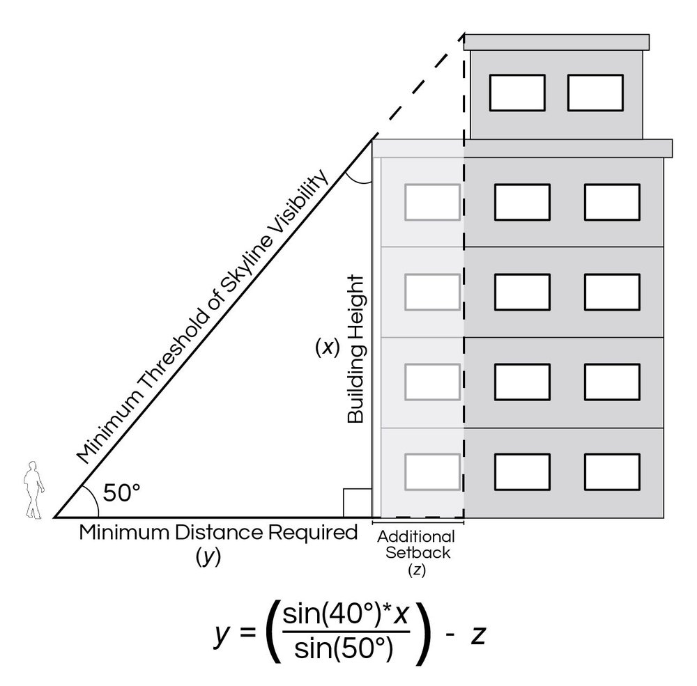
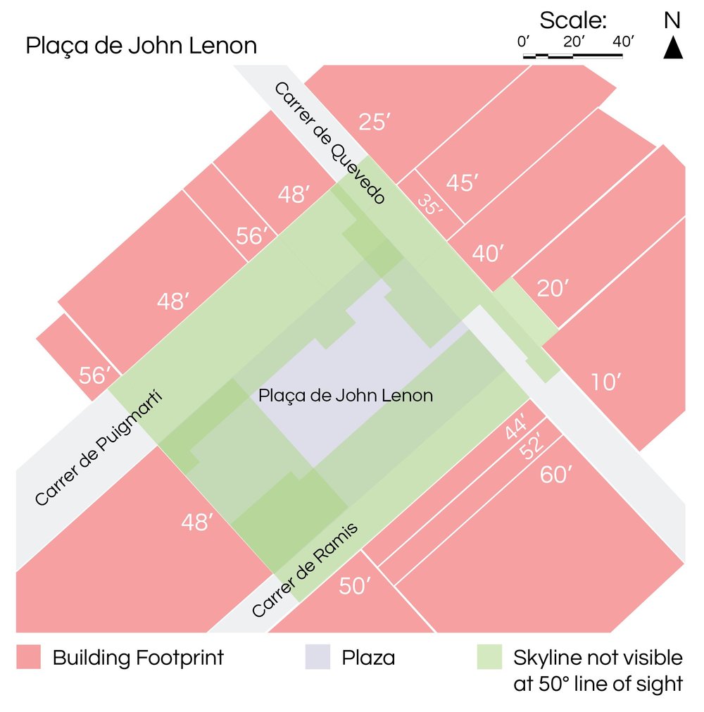
This angle creates a golden rule for estimating optimal building heights around a square to avoid feeling oppressed and overwhelmed15. Humans feel more comfortable when they can glimpse sky above the buildings within their angle of vision. A hospitable square must have a substantial area near the center of the square where a group of people may gather, face and talk with one another, and where each person sees a little sky above the building they are facing. In a 100 x 100 feet square a “sky-view island” should be approximately 30 x 30 feet; in a 100 x 200 feet square, the “sky-view island” would be 30 x 60 feet.

If buildings along the side of a square are of different heights, some buildings may be higher than this. We have a wide horizontal field of vision (210 degrees). We are not so discomfited by one tall building providing we can still see sky on either side of it without turning our head.
There are numerous examples of well-functioning neighborhood squares that illustrate these principles. Venice has six major neighborhood squares (campi) and innumerable smaller squares (campielli) that, until the tourist industry ballooned in the 1990s, provided the ideal setting for community social life, for children and elders, for shopping, vegetable and fish markets, and for community festivals. Some still do.
The Gracia neighborhood in Barcelona boasts ten neighborhood squares (plaças). Each has its own character, and is slightly different in size, though all dimensions are from a minimum width of 80 feet to a maximum length of 220 feet. Some are lively, favorite spots where people congregate throughout the year. Others are very quiet, playing a modest role in supporting community social life. While many factors have influenced each square’s success, one important factor is their proportions.
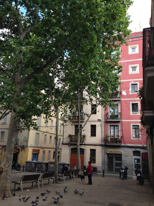
Plaça del Raspali feels hemmed in by its surrounding buildings, even though five streets lead into it. The square is only 80 x 90 feet, but the buildings on two sides are four to six stories high (50-60 feet). The buildings contain some essential resources—a bakery, barbershop, pharmacy, and a bar/restaurant, and the square has hosted occasional neighborhood festivals and pop concerts, but on a daily basis, it is very quiet. The population around the square is largely Romani, which suggests this may be a more affordable neighborhood than those around the larger, more hospitable neighborhood squares.

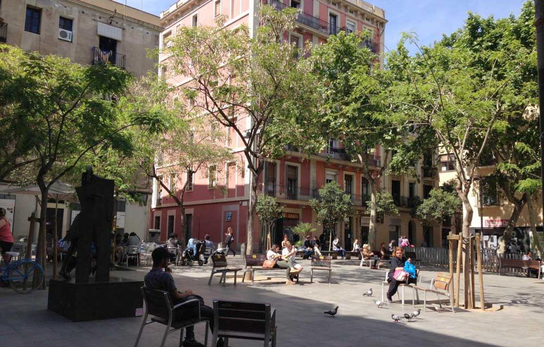
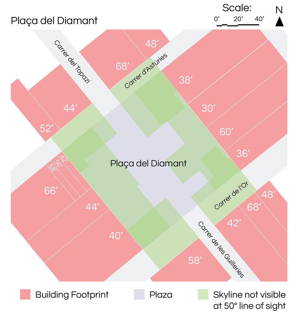
Plaça del Diamant (see photo at top of article) is a little larger at 19,200 square feet (120 x 160 feet) than the square proposed for Portland, and it has six streets leading into it. Each side consists of four buildings, from two to six stories. Only two small buildings are six stories so from the large area in the center of the square (approx. 50 x 120 feet) there is always a view of the sky within one’s field of vision.

Plaça de John Lennon measures almost exactly the minimum required size of Portland’s neighborhood square—16,100 square feet (115 x 140 feet). Four streets lead into it at the corners. Despite its small size it does not feel claustrophobic. On one side, the buildings are two and three stories high. On the other three sides the buildings are four stories. One side has two additional floors tucked into a pitched roof, with stepped-back terraces that achieve a six-story building without impeding the angle of vision. The square has a substantial area (40 x 80 feet) within which you can see the sky in all directions.
There are continuous stores and businesses around the square that seem to be flourishing (café, computer stores, print shop, computer repair store, ice cream, and patisserie, etc.). With a secondary school at one corner, the square becomes jam-packed when school lets out as kids zoom around on scooters and roller blades, play football and tag around adults’ legs, chatter in building niches, and adults sit at the café.
To create a hospitable neighborhood square is a real challenge for any American city. But Portlanders have led the way in city livability before. In the 1970s, citizens demanded that a proposed 12-story parking garage at the heart of the city should instead be a public square. After a design competition, the beautiful arena-like Pioneer Courthouse Square was built, now proudly called “Portland’s Living Room.”16
I would have thought that if any American city can create a neighborhood square, Portland would be the first to do it. But perhaps the process needs the input of form-based urban designers. Unless they are uniquely visionary, and dedicated to public well-being, building developers whose primary concern is to maximize returns may not be the best people for the job. Holly Whyte ran across this problem back in the 1970s in New York when he argued for creating pocket parks in exchange for increased heights. He was sorely disappointed by the poor quality of public plazas that resulted.
Portland is proud of its heritage of robust civic engagement in planning decisions. At the opening session of the 2013 International Making Cities Livable Conference in Portland, then-Mayor Charlie Hales said: "People who live [here] have a right and expectation to be involved with the future of their own community; it's not just what planners or developers want."17
And Elaine Cogan, who was instrumental in setting up Portland’s public involvement system, always emphasized, “Genuine engagement with the public requires commitment, perseverance, time and money.”18
In creating the public realm—the part of the city that belongs to the people—it is the responsibility of elected representatives, their staff and commissioners to represent the public interest, and prevent a developer from cramming through a public space that violates the Master Plan and fails to support its intended social functions.
In the final analysis, if the city does not represent the people’s well-being, and protect the intent, Standards and Guidelines specified in a Master Plan, then no amount of community engagement will succeed in ensuring a neighborhood square that supports social life and community.
In Portland, the community, planning staff, city representatives, architect and developer of the square block are still struggling to achieve what is required in the Master Plan, “a hospitable neighborhood square… a significant, iconic urban place.”19
This article appeared in The Western Planner.
Resources:
- Alberti, Leon Battista - https://en.wikipedia.org/wiki/Leon_Battista_Alberti
- Alberti - De Re Aedificatoria (On the Art of Building) - https://en.wikipedia.org/wiki/De_Re_Aedificatoria
- Conway Master Plan – http://www.northwestdistrictassociation.org/wp-content/uploads/2012/06/12-0423-Con-way-Master-Plan.pdf
- Gehl, Jan. (2010) Cities for People. Island Press
- Sitte, Camillo. (Translated by Charles T. Stewart) 1945. The Art of Building Cities. New York, Reinhold Pub. Corp.
Endnotes:
- Crowhurst Lennard, Suzanne. (in press) Public Places, Community, and the Physical and Mental Health of Children and Elders, in Stafford, Philip (Editor) The Global Age-friendly Community Movement. Berghahn
- Crowhurst Lennard, Suzanne, and Lennard, Henry L. (2008) Genius of the European Square. Gondolier Press.
- Mouratidis, Konstantinos, (In press) Built environment and social well-being: How does urban form affect social life and personal relationships? https://doi.org/10.1016/j.cities.2017.10.020
- http://www.livablecities.org/blog/why-we-need-neighborhood-squares-part-5-sociability-and-health
- http://www.northwestdistrictassociation.org/wp-content/uploads/2012/06/12-0423-Con-way-Master-Plan.pdf
- http://www.northwestdistrictassociation.org/wp-content/uploads/2012/06/12-0423-Con-way-Master-Plan.pdf
- http://www.livablecities.org/blog/principles-designing-successful-neighborhood-squares
- Sitte, Camillo. (Translated by Charles T. Stewart) 1945. The Art of Building Cities. New York, Reinhold Pub. Corp. P. 21
- Bacon, Edmund. (1967) Design of Cities. Viking Penguin. P. 15
- Sitte, Camillo. Op cit. P.2
- Alberti, quoted in Kostof, Spiro. (1992) The City Assembled. Boston, Little, Brown & Company. P. 137
- Kidder Smith, G.E. (1955) Italy Builds. London, Architectural Press
- Webb, Michael.(1990) The City Square. London, Thames and Hudson
- Gehl, op. cit. p. 39
- http://www.livablecities.org/blog/designing-successful-neighborhood-squares-part-6-surrounding-building-heightsproportions
- https://en.wikipedia.org/wiki/Pioneer_Courthouse_Square
- http://plannersweb.com/2013/08/reflections-on-portland-part/
- http://plannersweb.com/2013/08/reflections-on-portland-part/
- http://www.northwestdistrictassociation.org/wp-content/uploads/2012/06/12-0423-Con-way-Master-Plan.pdf 10.A


