Not hard to design a great public space
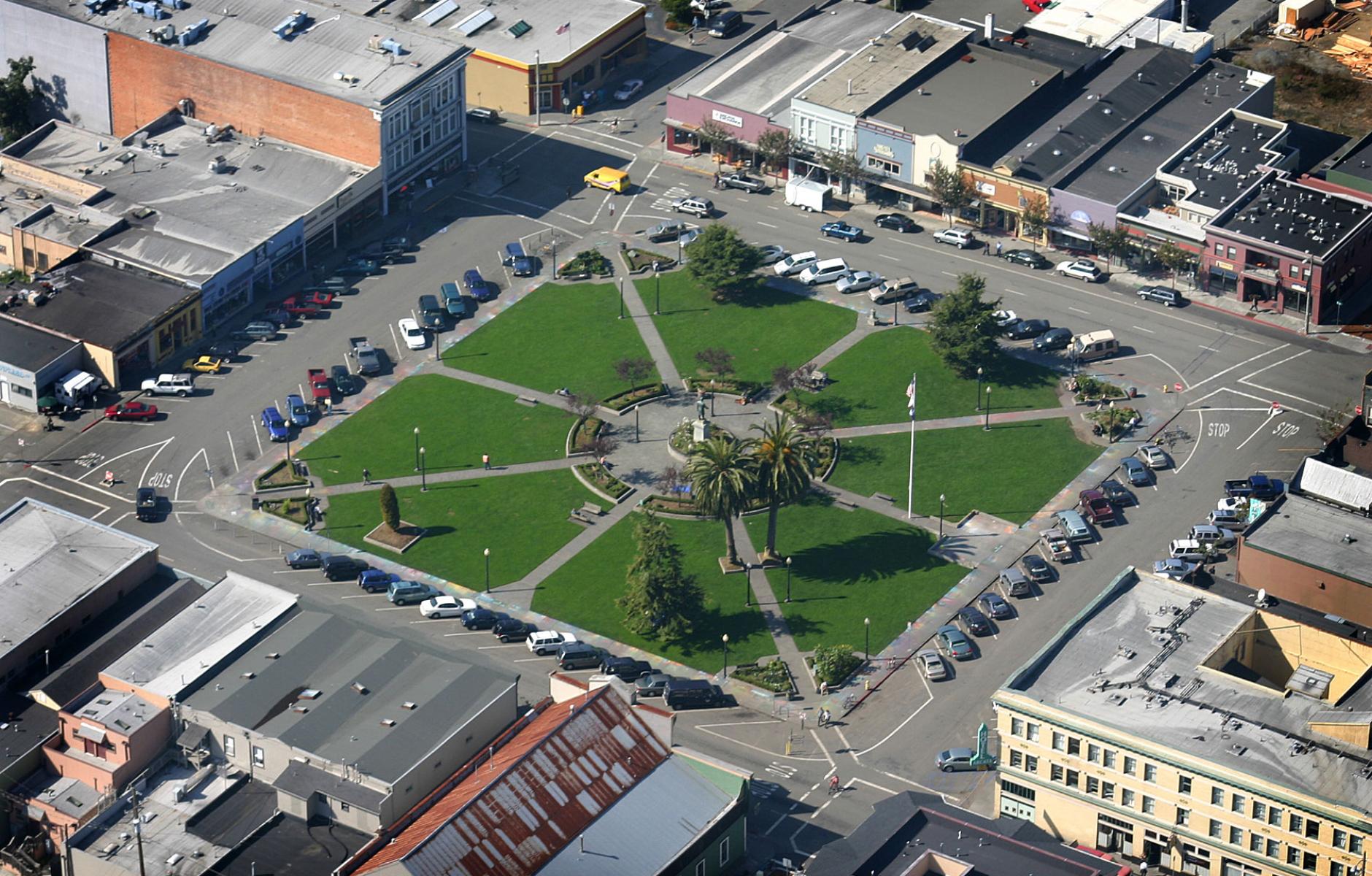
Arcata Plaza, laid out along with the town’s first streets in 1850, was first used to load lumber from the sawmill—and has served as the commercial heart of the Northern California town ever since. Arcata Plaza is a square, literally, and the design is not complicated. A square should not be too big, and the dimensions of the green space in the middle are just over 200 feet on each side. The distance between buildings is 350 feet, creating a comfortable “outdoor room.”
The buildings on Arcata Plaza are mostly one and two stories, with two rising to three stories. They are mostly simple architecturally. If the space were bigger, the square would likely need taller buildings to maintain a sense of enclosure.
The square has accommodated the automobile through one-way streets and angle-in parking—which creates substantial parking in the absence of parking lot. The one-way system is not technically necessary, and the square would likely thrive with two-way traffic.
Yet the plaza, as it stands, works beautifully as a public space. It has lasted for 170 years. It would not be too difficult or expensive to build today.


