The chameleon of urban architecture
In the Excursus appended to the end of the influential 1978 book Collage City, Colin Rowe and Fred Koetter include what they call “an abridged list of stimulants … as possible Object Trouves in the urbanistic collage.” One of these found objects is the idea of a building type they called Ambiguous and Composite Buildings. Their examples included sprawling palaces from Munich, Vienna, and Compiegne and are described in figure-ground drawings that demonstrate extraordinary geometric contortions as the buildings both react to and shape their spatial contexts. Although the buildings address and clarify the context, they are often polymorphic and polylingual and harder to perceive as a single entity. The buildings are less coherent, so the context around them can be more coherent.
Even in an American grid context, there are a number of recurring instances where deploying an “ambiguous and composite building” solves problems. The simplest might be when a building sits on the corner of a commercial street and open space plaza (or park) and a residential side street. These two contexts require different approaches. The uses and ground floor frontages will be different, one perhaps a commercial frontage and the other a residential frontage; door yard or other. The height may be different; the building may step down on the residential street from a greater height on the commercial street. The character could be different; the commercial side may be more demonstrative, and the residential side more restrained. The two facades may or may not be in the same architectural language; the commercial may be more contemporary, the residential more traditional, etcetera.
If the building occupies the entire depth of the block, the situational need for transition is often magnified. The “rear” street/context is often much different from the “front” or from the “side” (in actuality the three are all “fronts”). If the building is typologically a “wrap building” and contains a parking structure, the “rear” street frontage is often may be made by townhouses lining the parking structure for example. A building that can address multiple conditions with appropriate varied “fronts” and mask its services at the same time is a welcome addition to the neighborhood.
An ambiguous and composite building transforms to specifically address the varied urban conditions around it. The building may even play a role in defining that context as well as responding to it. One of the strongest urban design themes is the idea of crafting an ambiguous and composite building that morphs as it mediates the transition between the varied contexts surrounding it. To be sure, many urbanists and their buildings employ this technique, but, generally, the phenomenon needs to be more widely recognized and utilized.
Two examples can illustrate the idea, The Muse in Alexandria, Virginia, and the Apollo on H Street in DC, both by SK+I Architecture.

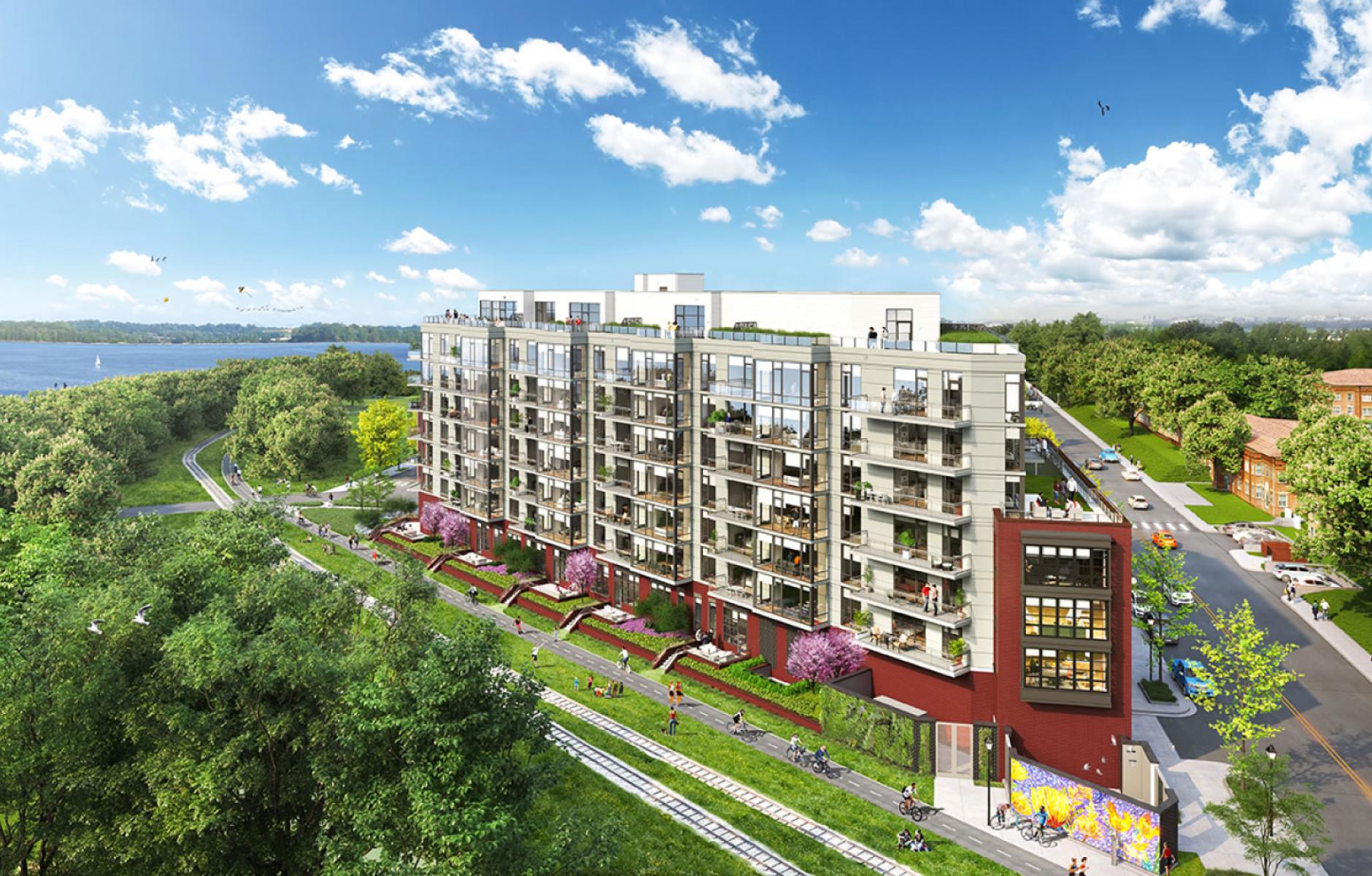
The Muse sits on a triangular site at the corner of North Royal and 3rd streets in North Old Town Alexandria. The streets form the right angle of the triangle and the hypotenuse is formed by the “rails to trails” right-of-way of the Mt. Vernon Trail. The Old Town North Master Plan designated the height for the block to be 77 feet, with a 50-foot height limit on North Royal and a requirement for a “transition” on the Third Street side. The master plan illustrated a 77-foot tall, L-shaped building with a façade stepdown to the two streets and a courtyard facing the trail.
The proposed building, currently under construction, is a composite building comprised of a 77-foot-tall bar building fronting on and parallel to the trail, with 50-foot-tall “shoulders” and “jewel box” on the corner. The site design forms a public passage between the corner building and the bar building. North Royal is the location of the Arts Walk in Alexandria and this passage is a two-sided addition to the arts walk. Exhibition space and studio space is provided on the ground floor to either side. The shoulders combine with the corner building to create a liner that addresses the streets. The bar building fronts the trail and makes a neighborhood/city edge that offers views over the river. The character of the buildings also morphs as the street-facing shorter buildings are more traditional being comprised of walls with punched openings, and the trail facing bar building offering views over the Potomac River is more contemporary; comprised of curtain wall. Some of the units have entrances directly on the trail, with a small patio area (see rendering at top of article).

The Apollo on H Street is perhaps more nuanced as it behaves as something of an octopus with two “tentacles” or appendages occupying out lots attached to the main H Street lot. While the bulk of the site occupies 450 feet of block frontage along H Street, a prominent tentacle stretches north and occupies 150 feet of frontage on I Street, and the second tentacle reaches out to the east and occupies 50 feet of frontage on 7th Street. Eight and nine stories tall, the H Street frontage includes ground-floor retail and three stylistic and material building increments. The I Street frontage is three stories tall with a fourth level set back from the street wall. It has residential ground floor units and dooryards that reflect the townhouse fabric found there. Lastly, along the 7th Street frontage is a three-story, remote co-working loft just around the corner from the commercial H Street. One would be hard-pressed to conceptualize that this was a singular building based on its outward appearances.

The notion of an “ambiguous and composite building” is essential in urban work to craft buildings that provide transitions between disparate contexts and are sympathetic and articulate in relating to their surroundings, even at the price of the building’s own identity.


