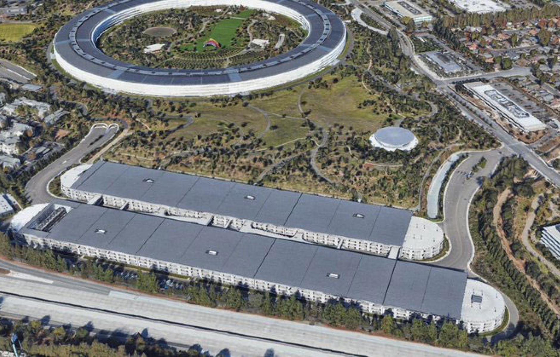
Apple Park(ing) and the high cost of corporate greenwash
It’s a pity that Apple chose a 20th Century model for construction of its headquarters. Our collective attention spans are short in 2022, and Apple’s massive office building landed like a spaceship in the sprawl of Silicon Valley more than four years ago—but we shouldn’t forget its cost.
“Apple's Park in Cupertino has so much space dedicated to car storage that you can fit all 272 Apple USA retail locations inside of its parking structures. To put that in perspective, Disneyland is the same square footage of all the parking at Apple Park,” writes Hayden Clarkin, The Transit Guy on Twitter.
The parking garages are beautiful as sculptural objects, with all curved edges visible on the exterior, including the vertical and horizontal concrete facade elements. But you really can’t hide the truth that Apple requires everybody to drive in, and drive out. Those employees and visitors are traveling long distances to work—not taking transit, walking or biking. The massive solar panels on the roofs are so much greenwashing.
Cupertino, California, imposed parking requirements that Apple complied to, but in this case I don't think the city can be blamed for all of this parking. The design itself requires a motor vehicle for every trip. Sure, there are buses, a more efficient motor vehicle, taking people in and out. But the vast majority will travel by personal automobile. That demands parking on the scale of a large airport.
It didn’t have to be this way. New urbanists in Northern California offered their services to Apple to design a mixed-use campus that is integrated with the surrounding city—to no avail. Two Israeli architecture students at the time, Shay Levanon and Amir Levanon, students of Hillel Shocken, drew up a plan that envisioned the campus as a large downtown. That plan didn’t require massive parking garages, each more than a quarter mile long, with 6,000 parking spaces.

A plan like that could have transformed Cupertino—providing a walkable urban downtown that is far more sustainable. But that wasn’t Apple’s goal. Apparently, the goal was secrecy and control, much like the Pentagon. In fact, Apple Park is on the scale of the Pentagon.

The Pentagon may more accessible than Apple Park. The Pentagon offers tours, or did until they were recently suspended due to Covid. When Apple shareholders met at the headquarters, they were refused tours by CEO Tim Cook, because “we have so much confidential stuff around.”
There must be better ways to maintain secrets. Amazon, another tech innovator, builds urban campuses. And think about all of the secrets that must be kept on Wall Street.
Apple Park reminds me a lot of Bell Labs in Holmdel, New Jersey, which I was fortunate enough to visit in the late 1980s with a friend. This building was a beautiful sculptural object, more like a computer chip than a spaceship, and it also had a massive amount of parking. I’ll bet that Steve Jobs appreciated the sleek design—even the parking lots were beautiful from a distance.
Such design can be impressive, but ultimately it comes with a cost.


