Dissolving border vacuums, part 1
The previous post on border vacuums discussed what borders were, why some borders create vacuums, and how these vacuums have affected Baltimore. This post will discuss solutions for at-grade border vacuums like parking lots and vacant lots, and over the coming months we'll discuss solutions for other kinds of border vacuums and see if they could apply to Baltimore.

New York's High Line Park
I invite readers to share solutions I may have overlooked so the discussion is as comprehensive as possible. (Also, I've omitted some conventional solutions – like Big Dig tunnels for highways – because they're usually expensive and unfeasible.)
Of course, no solution is a silver bullet. The fine print is context. For example, architect Witold Rybczynski, noting how many cities want to emulate New York's High Line Park (formerly an abandoned railroad viaduct that had devolved into a border vacuum), argued that the city's vibrant, dense, mixed-use Meatpacking and Chelsea districts made the High Line successful, and that the opposite strategy of “build it and they will come” – plop a High Line in an isolated area and hope that the vibrant urban fabric follows – would likely garner disappointment.
Finally, my intention is not to take a “fix it all now” position. These ideas are presented under the auspices of long-term incremental improvement – that of incorporating more thoughtful design when infrastructure and facilities are inevitably repaired, replaced, expanded, added, or removed. Perhaps this way border vacuums can be gradually dissolved rather than maintained by periodic reconstruction of the status quo.
Infilling parking lots and vacant lots
Parking lots and vacant lots are arguably some of the most corrosive border vacuums: they break the continuity of street walls by exposing party walls (“missing teeth”) and creating an atmosphere of dereliction. The effect is particularly destructive in rowhouse neighborhoods where the fabric relies on the appearance of continuity for stability.
Fortunately parking lots and vacant lots are also some of the easiest border vacuums to dissolve (if the demand for infill is there, of course) and their infilling has generally been greeted with enthusiasm in Baltimore. But what exactly constitutes good infill?

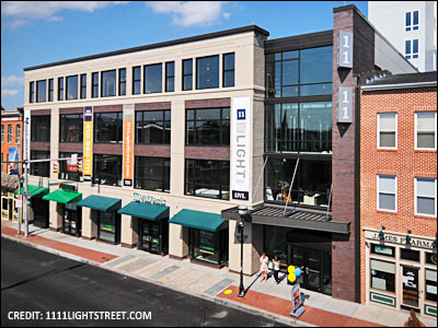
1111 Light Street in Federal Hill
Urban infill works best when it takes the form it has traditionally taken: Multistory, multiuse, and built out to the sidewalk. The infill should offer a porous facade to the sidewalk – it should interact with passersby via storefronts, stoops, porches, bays, balconies, discrete windows, and other features that reflect a human presence. Blank walls and vague “open spaces” or setbacks should be avoided.
By doing all this, good infill will form an engaging “street wall” that defines the street as a public room (see above). To avoid breaking this street wall, parking lots and garages should be stashed in back and accessed by alleys. Furthermore, good infill should be composed of small blocks punctuated by continuous street networks. These streets can be made quite intimate, further enriching the pedestrian experience.
Finally, good infill will feature a small increment of development: rather than being built by one developer in a short time, multiple blocks of good infill are composed by many people who have contributed different buildings over a long time. This results in an organic form that can accommodate Jane Jacobs' aged buildings: “A district must mingle buildings that vary in age and condition [to] incubate diversity. If a city has only new buildings, the enterprises that can exist there are limited to those that can support the high costs of new construction. Mingling of new and old buildings, with consequent mingling in living costs and tastes, is essential to get diversity and stability in residential populations [and] enterprises (Chapter 10, The Death and Life of Great American Cities).”
Infill examples

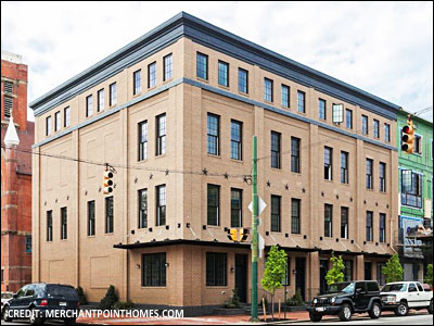
The Merchant Point Townhomes in Fell's Point
Generally the smaller the increment of development has been in Baltimore (as with rowhouses or midrise buildings), the better the infill quality has been. Unfortunately, generally the larger the increment of development has gotten, the more likely it was to be marred by street-facing blank walls, parking garages, and service infrastructure.
The Merchant Point Townhomes at Aliceanna and Ann Streets in Fell's Point are an example of good lowrise (rowhouse) infill. Built atop the site of the historic St. Stanislaus Kostka complex, the rowhouses offer attractive steps, overhangs, discrete windows, and other friendly, human-scale details to the sidewalk, just like traditional rowhouses. The garages were placed in the back (accessed by an alley) to avoid sacrificing the Aliceanna Street facades to blank garage doors.
However, I think these rowhouses could have done a better job “turning the corner” at Ann Street. Right now the corner rowhouse offers just one first-floor window to Ann. If the garage in that corner rowhouse had been sacrificed for a wraparound storefront, these rowhouses would have done a better job connecting to the buildings along Ann, improving pedestrian delight and block continuity in the process. In fact, the 19th century rowhouse on the northwest corner of the same intersection is a perfect example of just such a strategy.
I've noticed that this lost opportunity for “turning the corner” is surprisingly common among recent infill rowhouses. The porosity of the primary (front) facade is usually quite good, but that of any secondary (side) facades could be better. If too many infill projects treat their secondary facades as an afterthought, there is the risk of turning the streets along those facades into “B” streets that are less desirable for pedestrian exploration, potentially fraying the connections between different streets (and neighborhoods!) in the process. This is rather unfortunate because Baltimore has many old rowhouses that do a wonderful job “turning the corner,” and they could be useful examples for future infill rowhouses.
The Twelve09 Condominiums at Preston and Charles Streets in Midtown-Belvedere are an example of good midrise infill. Built atop a former parking lot, this mixed-use building avoids the blank wall effect along Charles Street by using a retail liner (built out to the sidewalk) to conceal the structured parking in the center of the block. The building's facade also employs numerous details, like bays and balconies, to maintain pedestrian interest.

The Twelve09 Condominiums in Midtown-Belvedere
But again, while the building's Charles Street facade is quite good, its Preston Street facade could be better. The retail liner along Charles “turns the corner” onto Preston, but then it abruptly gives way to a first-floor facade with nothing but ventilation grilles, services doors, and an entrance to the parking garage. This infrastructure could have been placed along the rear alley (Lovegrove Street) instead, which would have allowed additional storefronts to line Preston Street.

Perimeter blocks in Hamburg, Germany
Finally, I think the Hilton superblock next to Camden Yards is an example of “meh” highrise infill. Although it was built atop former parking lots, some of the complex's street-level facades offer little to the pedestrian. True, the eastern block offers several restaurants, but the western block's southern facade offers only blank walls, grilles, and garage doors – right across from Camden Yards! I think these shortcomings could have been avoided if the Hilton had been built in a perimeter block format (see above): one or two portals leading to a central “backstage” area would have eliminated the need for dispersed service doors, garage doors, and other infrastructure on the perimeter, leaving it free for pedestrian-friendly programming.
What if a parking lot or vacant lot can't be infilled?
It would be ideal to infill as many parking lots as possible, but for various reasons some parking lots can't be infilled, at least not right away. How can we mitigate their border vacuums in the meantime?
The conventional strategy for shielding pedestrians from parking lots is to enclose them with low walls. But these boring walls do nothing to enliven the street. It may be preferable to enclose parking lots with liner buildings. Even narrow liner buildings can accommodate mixed uses or rowhouses. It's also possible to redesign parking lots as multipurpose plazas. That is, the lots could be enclosed, paved, planted, and furnished in a manner such that they could be used as public rooms in which cars would be permitted to park when there is little activity. (For example, perhaps someday the Waverly Farmer's Market parking lot could be improved this way.)
It's not always possible to infill some vacant lots either. If the infill demand isn't there yet, how can we mitigate their border vacuums in the meantime?
Some vacant lots can be turned into community gardens, patios, side-porches, and parklets, and the “missing tooth” appearance can be remedied by extending the street wall across them (see pages 28-32). Nevertheless, these strategies have their limits. Turning too many vacant lots into parklets risks diluting recreational activity – and maintenance efforts – over too large an area; it's better to concentrate that activity in a handful of parklets.
The next installment will discuss solutions for more at-grade borders (like arterial roads). Subsequent posts will discuss solutions for sunken borders (like highway and railroad trenches), elevated borders (like highway viaducts and railroad embankments), congregational borders (like arenas, sports facilities, and convention centers), superblock borders (like hotel, office, and parking complexes), Radiant City/Garden City borders (like tower-in-the-park housing projects, garden apartment housing projects, office parks, strip malls, and big-box facilities), campus borders (like hospital and university complexes), recreational borders (like parks and cemeteries), and various other borders (like prisons), so stay tuned!
This piece originally appeared in the EnvisionBaltimore blog.
For more in-depth coverage:
• Subscribe to Better! Cities & Towns to read all of the articles (print+online) on implementation of greener, stronger, cities and towns.
• Get the January-February 2012 issue. Topics: Made for Walking, walking audits, Takin' it to the streets, Queens development weathers Sandy, Shared space taken to a new level, Streetscape spurs downtown turnaround, Florida streets manual gets traditional neighborhood chapter, Is better parking lot design enough?, Cities in small metros growing, Redesign arterial streets for pedestrians.
• Get New Urbanism: Best Practices Guide, packed with more than 800 informative photos, plans, tables, and other illustrations, this book is the best single guide to implementing better cities and towns.


