Occupy Main Street
An old Chinese proverb says, “The best time to plant a tree was 20 years ago. The second best time is now.” In other words, it’s not too late to fix the economic and social problems the recent rebuilding of Main Street brought to town.
Great Barrington’s Main Street has lost the curb appeal that helped make it the Smithsonian’s best small town in America. “That’s just aesthetics,” some will say — including a few who contributed to the design decisions that make the new Main Street so ugly — but what real estate brokers and developers call “curb appeal” is not just aesthetics. It has economic value and social outcomes.
Let’s look first at the trees on Main Street. Studies by groups like the city of Portland, Oregon, the Yale School of Forestry and the National Association of Realtors show that majestic street canopies like the one Great Barrington used to have increase retail sales and real estate values. Surveys in which people walk around towns and cities recording the places they like and don’t like show that we are attracted to places with beautiful trees. The book The Happy City establishes that beautiful, mature trees increase our day-to-day happiness, and a growing body of research in cognitive science is beginning to record the data behind these effects.
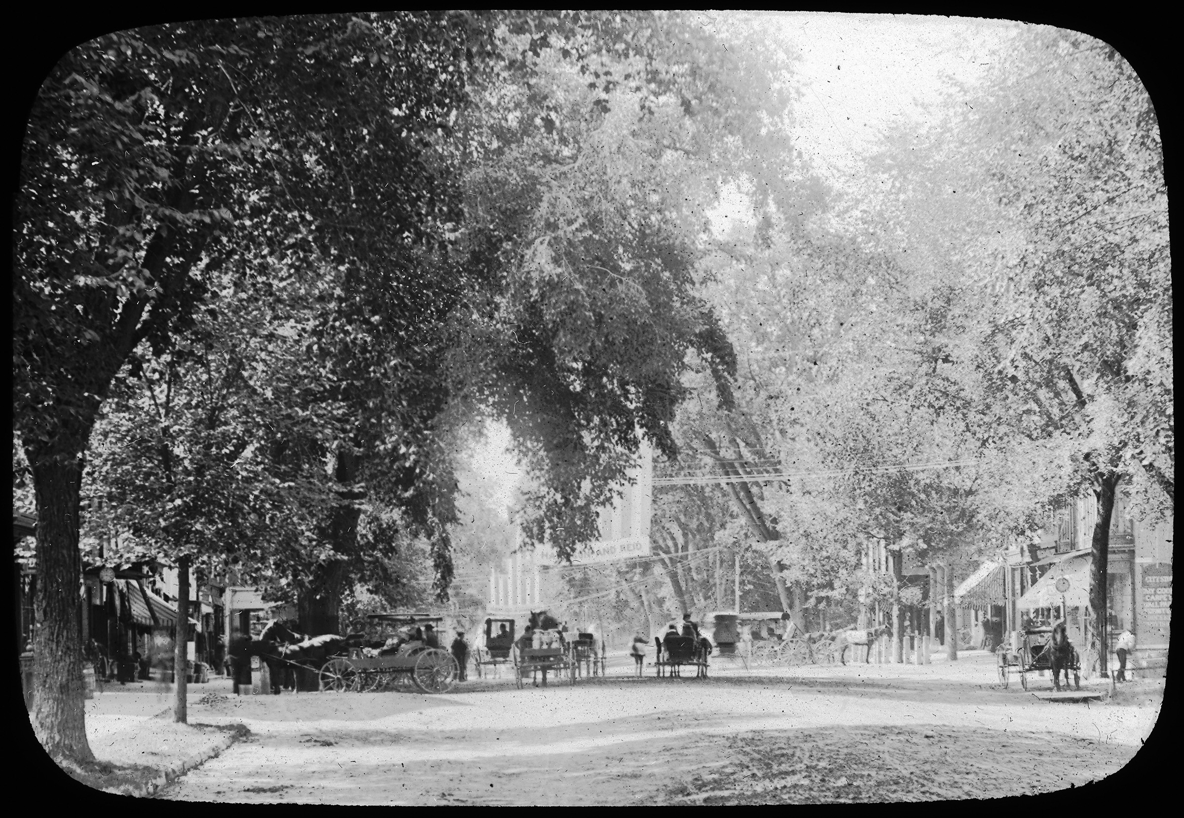
The details of the design of the street, the sidewalks, and the streetscape matter too. We know what it takes to get people to get out of their cars and walk: people want streets that are safe, interesting, comfortable, and convenient. “Safe” has many aspects, including not being too close to rushing traffic. “Comfortable” includes being able to get away from the hot sun in the summer, as well as being able to walk in the warming sun in the winter (think “trees”).
“Convenient” means that there are more than one or two things to do when you get of your car—something Great Barrington has in spades (But note that when a law firm or real estate office replaces a good store or restaurant, pedestrian traffic goes down). “Interesting” also means many things: interesting things to look at (including storefronts and buildings); beautiful things to look at (one of the things cognitive science has proven—beauty is not in the eye of the beholder); and good people-watching. We are social beings, and we love looking at each other and running into friends. That’s one of the things that makes us value town centers. When we drive on modern roads, our neighbors become our adversaries, slowing us down and keeping us from getting where we want to go.
This is anecdotal, but I noticed in the week before Labor Day that the number of teenagers hanging out on Main Street was a lot less than I’m used to. Restaurants seemed emptier (several had stopped serving lunch), and I never saw a crowded store. The only restaurant I saw with lots of customers is one everyone drives to, just on the edge of town. What’s needed is what architects call a post-occupancy survey, comparing both sales receipts and public attitudes before and after the rebuild.
For now, we can talk about some of the design details, which is my field. I said above that beautiful mature street trees have economic and social value. The trees that were planted as part of the reconstruction project were chosen because they will never grow wide or tall.
In Street Design, The Secret to Great Cities and Towns, I wrote about why professionals from different fields don’t want to plant traditional street trees today. The reasons vary from profession to profession, but they all preclude the making of the majestic canopies that American Main Streets traditionally have. I also wrote about why the idea that the best way to deal with future blight is to plant many varieties is a fallacy.
One of the reasons given for the choice of trees that will remain small was a desire to use a “cherry picker” to go over the top of the trees to access the second and third floors if there’s an emergency in the buildings along Main Street. Much of my career has revolved around the Congress for New Urbanism (CNU), which the New York Times called “the most important phenomenon to emerge in American architecture in the post-Cold War era.” I surveyed friends and colleagues in the CNU about this and found that not one of them has ever worked in a town or city anywhere in the world that had that criteria for street design. Plain and simple, it is not the best way to protect lives or property in a fire, while it works against making a place where people want to be.
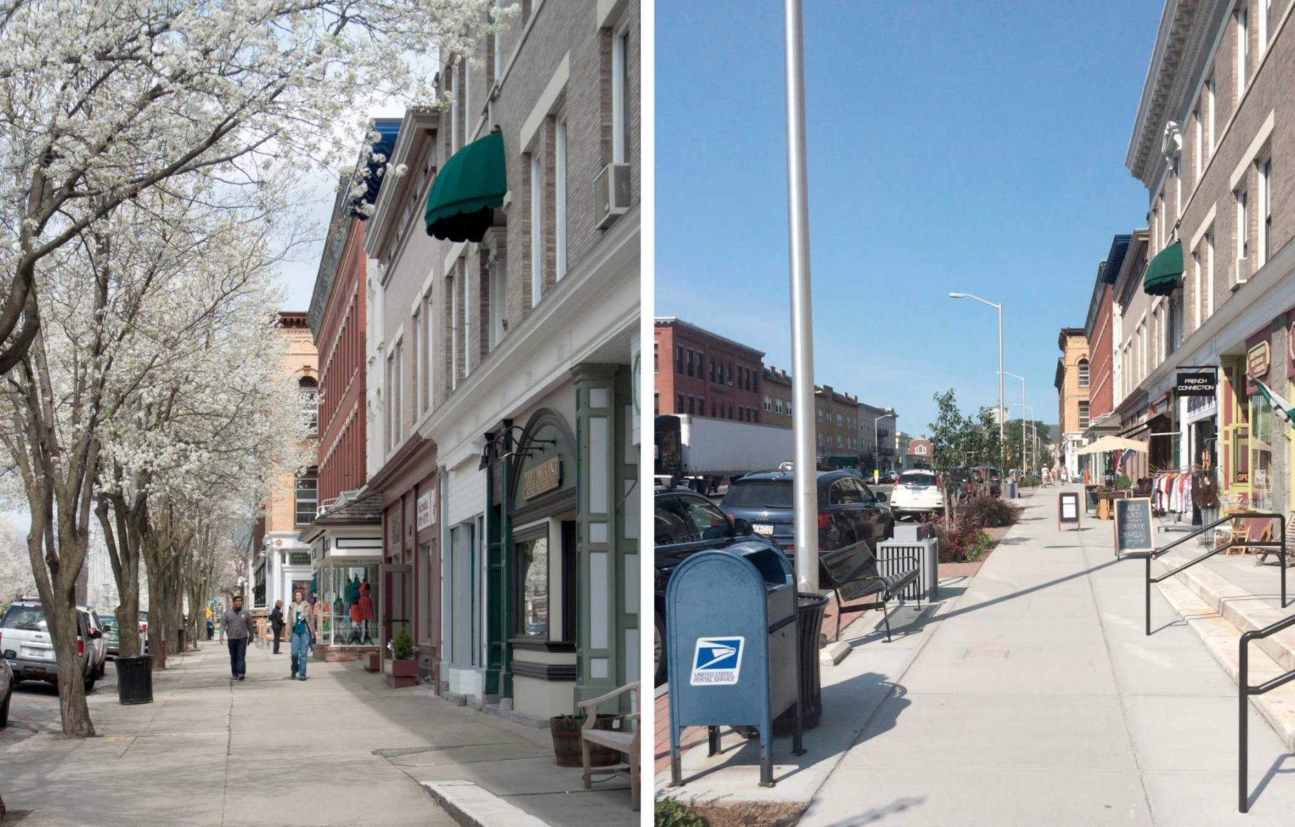
Similarly, we know from all the studies, surveys, and cognitive testing, that people like simple, harmonious, well-proportioned streets with good materials. The cheap concrete and the cheap concrete bricks, the oddly-shaped planters with attention-grabbing plantings, and the curbs that jump up and down and in and out are poor urban design and weak placemaking.
The highway-scaled lamps and oversized light poles are appropriate for exurban commercial strips (known as “auto-sewers”), but not for places where people are walking next to them. And so on and so forth, right down to the all the stripes and arrows in the roadway, bolder and brighter than the ones they replaced. The old simpler and less expensive sidewalks were places where people were more inclined to walk.
The good news is that legally, Great Barrington owns Main Street. In most states, the state controls what happens to state highways as they go through towns, but as one can see from signs at each end of town, Great Barrington owns and in theory controls the street between the brown bridge over the Housatonic River and the National Grid building.
I say “in theory” because the Massachusetts Department of Transportation (MassDOT) carefully controls the funding, and as the old traffic engineer joke goes, “What’s the difference between a DOT and a terrorist organization?” Answer: “You can negotiate with a terrorist organization.” But Massachusetts, almost uniquely among states, has a traffic code that differentiates between the design of town centers and state highways, and Great Barrington’s citizens and selectmen have the legal right to make the street work for the town. If surveys and tax receipts show that the new street is making commerce and public life worse, logic says that the town should do what it can to make Main Street a place where people want to be.
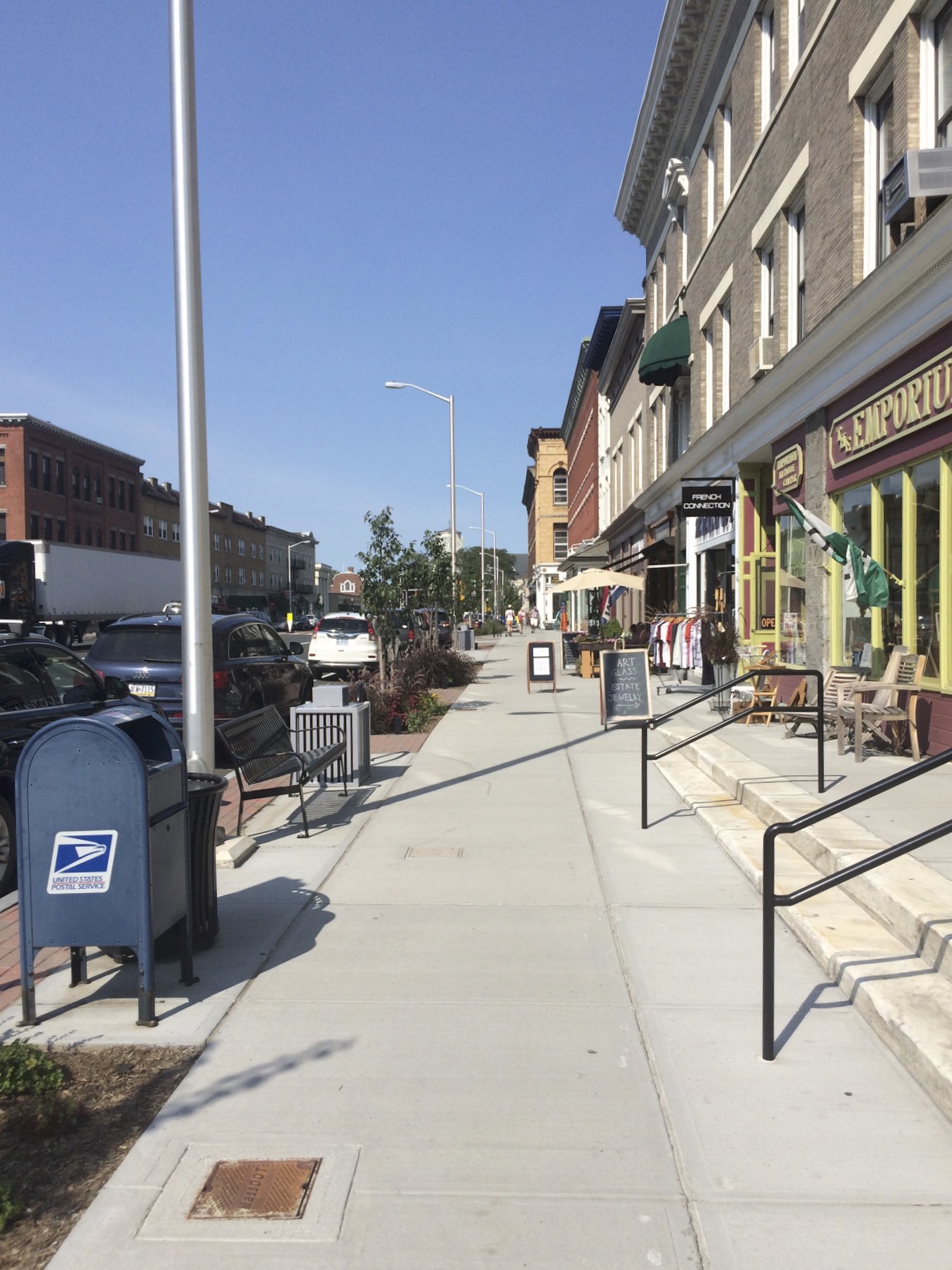
ADDITIONAL PHOTO COMMENTARY: While we were writing Street Design, The Secret to Great Cities and Towns, the Richard A. Driehaus Foundation gave us a good-sized grant to travel around and visit or revisit the streets in America and Europe that are usually considered to be the best places (which are only rarely also the best “transportation corridors”).
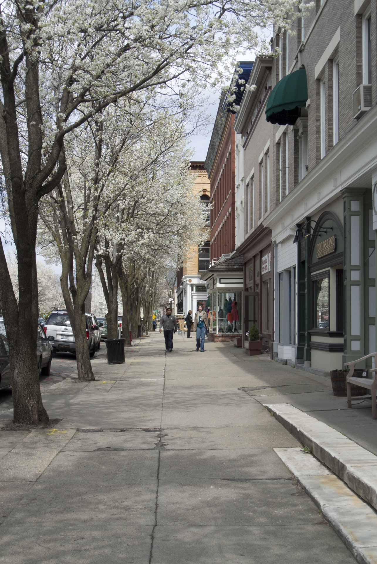
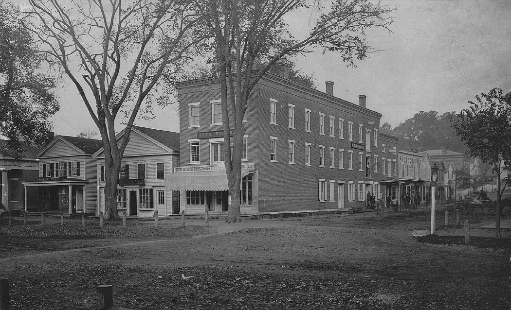
One thing we found was that the streets where people want to be are almost always simple, like Great Barrington’s old Main Street. The buildings, the trees, the sidewalks and the street all lined up, for example, and the sidewalk was a single material. The old street was simpler, more harmonious, and more beautiful.
The main material in the new sidewalk is a concrete that will probably be durable, but the concrete mix used before was more pleasing to the senses. Then the curbs jump in and out, the cheap concrete bricks are frequently arranged in a way that draws attention to the fact that they don’t align with neighboring shapes like the tree pits, the trees have a variety of shapes and sizes, the new pipe rail railings are cheap and visually disruptive, and the new lights are large, numerous, and more appropriate for a rural highway than a town center where people are walking (more on this below). It’s the type of design that makes the Director of the Project for Public Spaces say, “‘Streetscape’ is a dirty word.” A less expensive sidewalk, with fewer materials and better-quality concrete, would make a better place for people.
The new trees will never grow large enough to form a well-shaped space like the one in the photo above. History and studies show that people congregate in well-proportioned spaces like the old one. The new design simultaneously makes the sidewalk more open to the street, which is too wide for the buildings to successfully “contain” and erodes the space with knick-knacks, highway-scale fixtures, and a visual cutting up of the space.
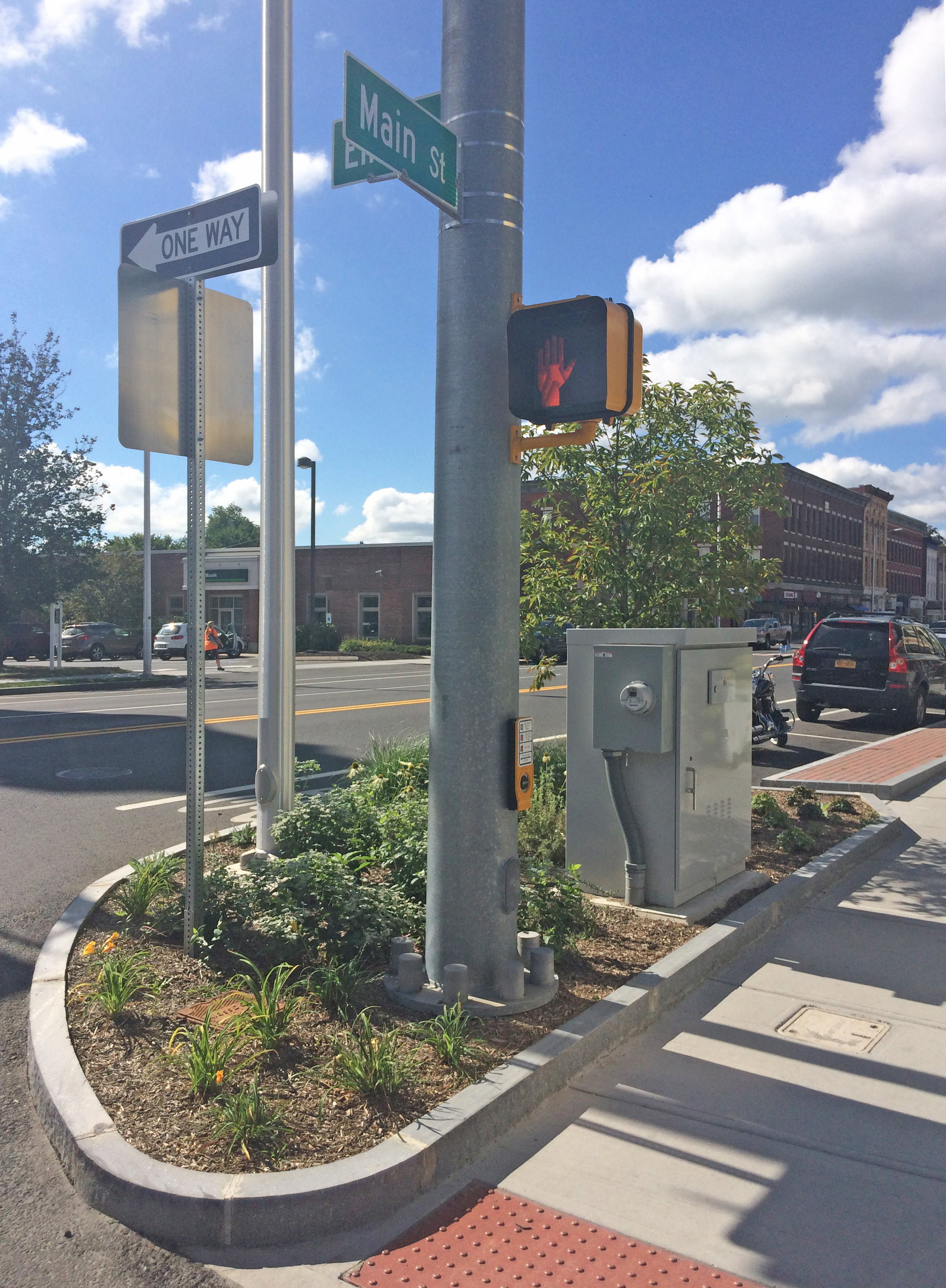
This highway-scale pole is not the largest pole in the new design, but it is typical of the lack of thought given to placemaking. The pole and the bolts holding it in place are inappropriate for town center where people walk, as is the electrical box, which could have easily been buried while the street was dug up. Even if the plants grow in they will still be unattractive, just like the odd raised curbs. The galvanized metal is the wrong material for lights in a town center, and they look even odder when painted “historic” poles are sometimes introduced. The yellow high pressure sodium bulbs used are considered out of date for town center use as well. Many American towns and cities are retrofitting their streets with LED lights, which use less energy, and which can be adjusted for a more pleasing light.
National retailers like The Gap and Williams-Sonoma know that replacing the wrong light in their stores with the right “warm” bulbs significantly increase sales per square foot, because people are more attracted to places with warm light. The same principle that works for The Gap makes us more likely to stand in front of Baba Louie’s at night and catch up with our neighbors.
In the photo, you can see the large corner radius between Elm Street and Main Street (meaning the curve that connects the curb on Elm Street to the curb on Main Street). That may have been of the justifications for the raised planting bed, since large corner radii can interfere with pedestrian ramps. Large corner radii are designed to speed auto flow and to allow large trucks to turn the corner without going up on the curb. But high speeds are inappropriate here, and trucks don’t need large corner radii who entering a wide street (Main Street) from a one-way street (Elm). The sidewalk detail is poor urban design, because it takes a large piece of the sidewalk away from the pedestrian, making it narrow, and produces an awkward, ugly, and uncomfortable place.
Also odd is the fact that pedestrians now need to push a button and wait for the walk light in order to legally cross the street. On a one-way, low-volume street like Elm Street, it’s unusual to give priority to cars like that, particularly when the busier, wider Main Street has the opposite treatment, giving pedestrians the right to cross at all times.
This article originally was published by the Berkshire Record and Massengale.com.


