What makes a good urban park
This article first appeared in Land and People, the magazine for the Trust for Public Land, in 1995. It also appeared in Better Cities & Towns in 2011.
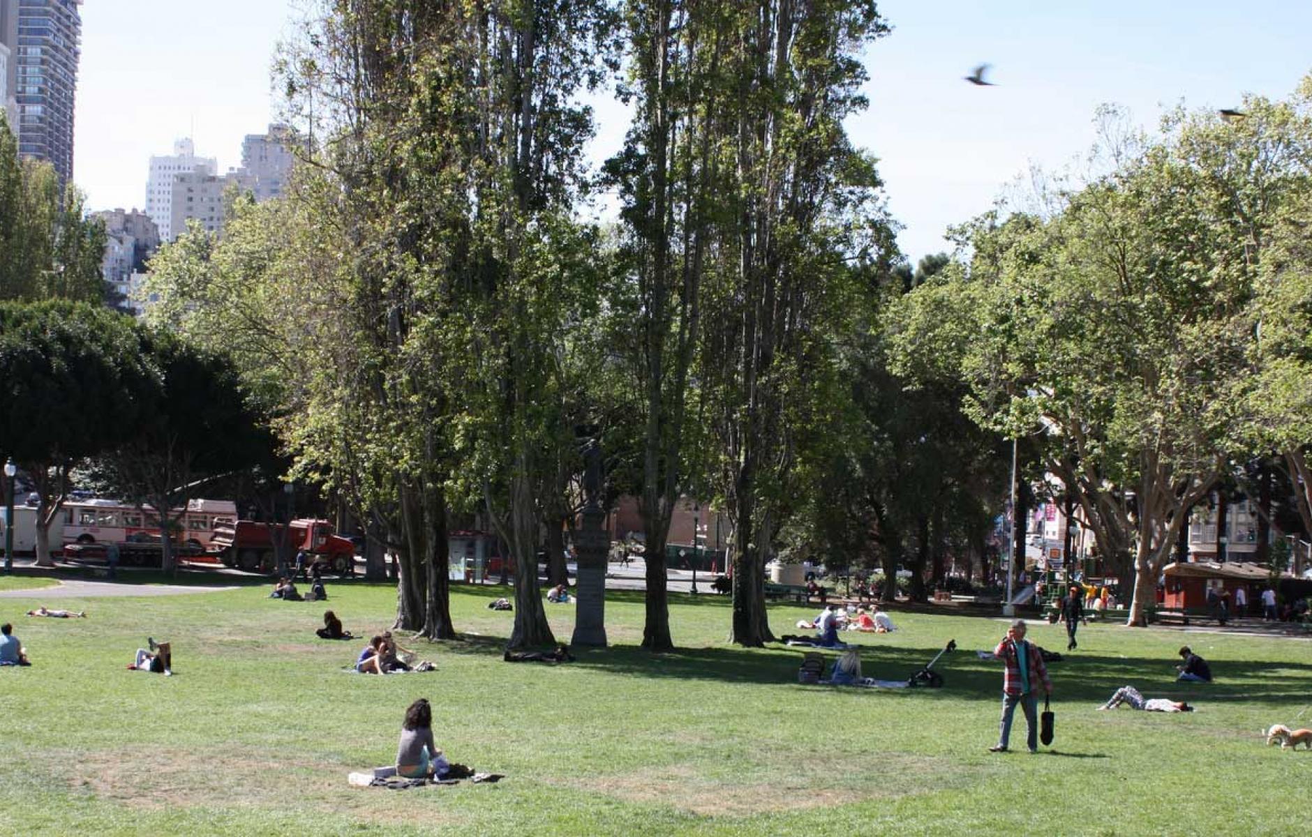
Everyone has a favorite park, or should. Mine is Washington Square, in the heart of San Francisco, bordering Chinatown and the laid back book stores and coffee houses of North Beach. First platted around 1850, the park is mostly open with a simple looping walkway. The subtle ripples and rolls of its naturalistic topography give me a sense of how the city’s hills and valleys must have once looked. In and around the park, neighborhood life flourishes. Regulars claim its sunny benches to read and chat. Elderly residents practice Tai-Chi. School children play frisbee. Commuters disembark from buses along the park’s edge on Columbus Avenue. Lunchtime picnics are daily events on the sprawling green lawn.
Unfortunately most small urban parks, particularly those in downtowns, fail to deliver the sort of civic experience that can be enjoyed in Washington Square every day. Such parks are the victims of strapped city budgets, the latest theories of crime prevention and the nervous tinkerings of overzealous designers. Ultimately, these assaults can be traced back to a larger cause–the disinvestment in cities which occurred as a result of America's postwar flight to the suburbs.
Though the money needed to build and maintain urban parks left town, the people who needed them most remained. By the seventies and eighties, when downtown land values soared along with the gleaming new highrises, it became ever-harder to realize the idea of a true public realm at the heart of our cities. Many once-proud parks like New York's Bryant Park and Los Angeles' Pershing Square fell on hard times. Lack of funds led to lower standards of maintenance and security, which in turn led to crime, drug dealing, and the use of parks as havens for the homeless.
Windswept plazas and sterile atria
But people's need for parks didn't go away. A new form of quasi-public space was invented by the private sector to meet the needs of downtown workers. Generous plazas such as those facing New York's Park Avenue and Avenue of the Americas were provided by property owners, often in trade for increased building height. Though such spaces provided a dramatic setting for the modernist boxes of Corporate America, the experience at ground level was sometimes less than appealing. The combined forces of wind, weather, and the airfoil effect of many of the heroic towers rendered the wide-open spaces below virtually uninhabitable for much of the year.
Enter the atrium, to tame the extremes of climate. In cities such as Montréal, Minneapolis, Atlanta, and Houston, an elaborate system of climate-controlled interior atria, lobby/gardens, and passageways enable workers to park, walk to their offices, go to lunch, run errands, and work out at the health club without ever having to set foot on a city street. These private, "public" spaces offer two essential elements that many city parks fail to provide: safety and a clean, well maintained environment.
But all is not well in the new downtowns and edge cities that we created over the past forty years. Like the proverbial sidewalks that in some places "roll up at five o’clock," these private corporate domains shut down not long after the close of business each day, forcing after-hours city-dwellers out into the now second-class public realm of the street. That once-vital street now resembles a ghost town; its restaurants and merchants have moved indoors to capture the more lucrative daytime trade.
The park as public forum
More troubling than the lack of downtown street life is the erosion of the intimate and longstanding connection between democracy and the public realm. Many popular movements have been played out in the town square–Czechoslovakia's Velvet Revolution in Wenceslas Square and the student demonstrations in Beijing's Tiananmen Square.

Free speech and soapboxes wouldn't stand much of a chance in the corporate plazas and shopping malls of today. Uniformed security patrols would whisk an offending citizen away long before a sympathetic crowd could ever form. Legal questions about private ownership versus public use have been debated in the highest courts. Special booths for pampleteers in many airports attest to the awkward compromises resulting from such court decisions.
Even more important than such legal issues are the issues of public versus private "character." Just as many of the corporate plazas of the sixties and seventies assumed the function of public parks, albeit poorly, the newest generation of city parks are too closely patterned after their corporate predecessors.
What makes a city park work?
What, then, defines a “good” park, a true urban public place? My own criteria for a successful urban park can be counted on one hand:
1. A park should be “nearby” for everyone. Public open space, such as a square or “commons” should be at the center of a neighborhood; no more than five minutes’ walk from most residents. Public buildings, shops (a corner store at minimum) and a transit stop should be near the center too. Smaller parks should be scattered throughout the neighborhood so that no one is more than three minutes’ walk from a park.
2. A public park should look and feel truly public. Being bounded by streets or sidewalks on all sides is one sure way to communicate "publicness." The presence of civic buildings and monuments also reinforces this public character.
Conversely, spatial relationships get confusing when private houses or buildings back up to a park, without a clear public zone in between. This ambiguous edge fosters conflict between those who live next to the park, and others who come from the surrounding area. A better approach would be for houses to front the park, so that porches, front yards, and streets buffer the edge between public use and private enjoyment.
3. Parks should be simple and not overdesigned. Trees, grass, some walkways and a bench: these are the basics of my ideal park. Unfortunately, many new parks are so "designed" that it’s hard just to find a patch of grass where one can sit in the sun, or a clear meadow to set up a volleyball net. A park can have a stong identity and implied use–for example, active versus passive recreation–but it should also have enough of the “basics” to satisfy the needs of a broad range of users.
4. A park should retain or enhance the natural contours of the land. In densely settled areas, its hard to get a sense of how the terrain looked before it was built over. I'm particularly aware of this in my own hilly city of San Francisco. I feel that too many new parks, both here and in other cities, are terraced and bermed beyond recognition. The legendary Olmsteds moved a lot of earth too, but they did it a way that always looked more natural than what they started with.
5. A good park should allow you to both see and walk through it. Part of this relates to obvious issues of safety, but this principle also relates to the earlier point about "overdesign." In many new parks, I feel like a victim of planning, forced to navigate an obstacle course just to get through.
By contrast, many older parks offer a simple network of walkways, providing a variety of routes for those who are just passing through. Such fleeting moments in an otherwise hectic day may be the only time that some city dwellers get to experience the pleasures of a park.
After years of neglect and misdirection, there may at last be some rays of hope for the future of urban parks. New York’s renovated Bryant Park and Boston’s Post Office Square have been runaway successes among a new generation of parks, largely because their designs respect the basics outlined here. They’re effective models which can and should be emulated in other cities. By contrast, Los Angeles’ redesigned Pershing Square and San Francisco’s new Yerba Buena Gardens, while welcome contributions to the public realm of their respective cities, seem overdesigned and cluttered to the point of dysfunction.
As planners, designers, citizens and local governments take a renewed interest in public spaces, I offer them all a bit of advice before they get back to their drawing boards: Get out and take a walk in a “good” park. Look at the elements that cause it to work so well. Talk to the people who use it and find out what features they value most. And while you’re there, don’t forget to smell the flowers.


