Community-oriented redesign for brutalist landmark
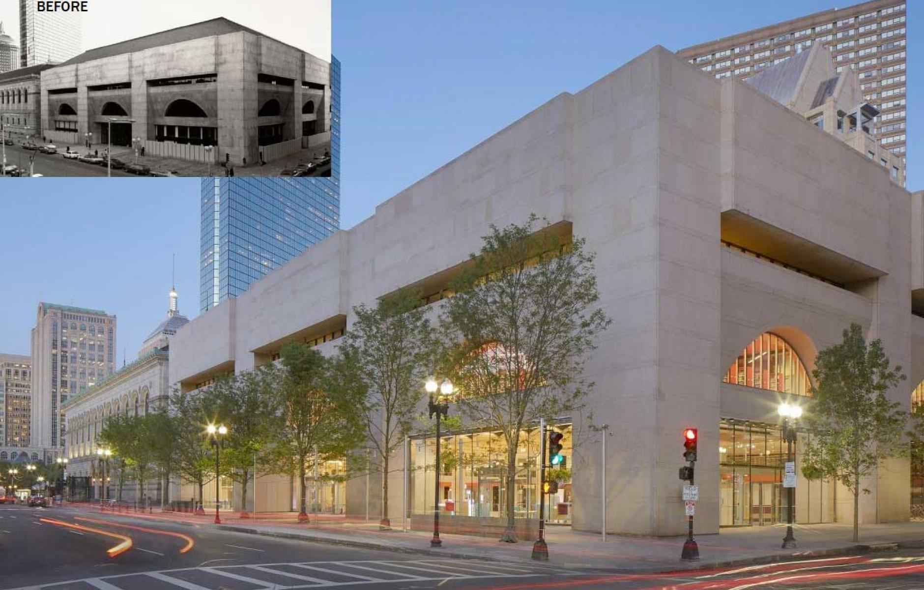
This 156,000 square foot renovation transforms the inward-facing 1972 wing of Boston Public Library’s central location into an inviting urban building that engages the street and forms an outdoor room with community gathering spaces. The renovation honors a landmark building while adapting the library to 21st Century needs.
The brutalist modernism that rose to popularity in the 1960s and 1970s is often forbidding to passersby, with blank walls that pay scant attention to pedestrians. The renovation has proven that such buildings can be reformed while respecting the style and culture of that era. A 40-year-old “architectural challenge” has been resolved with the new design, notes library president David Leonard.
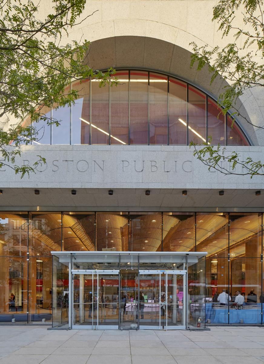
Furthermore, the library’s updated wing, designed by William Rawn Associates, rejects the notion that our major public buildings need to be walled off in the 21st Century. After the September 11 attacks, many US buildings were turned into virtual fortresses, often at the expense of public life. This building makes the statement that our society is open and accessible— a particularly poignant message in Boston, the site of a terrorist bombing in 2013.

“It’s a place where anyone can learn, can develop skills, and can access an incredible universe of resources. It is welcoming, inclusive, and dynamic space—just like our City …” says Mayor Martin J. Walsh. “It opens the library up to the street like never before. Now the connection between them will come alive.”
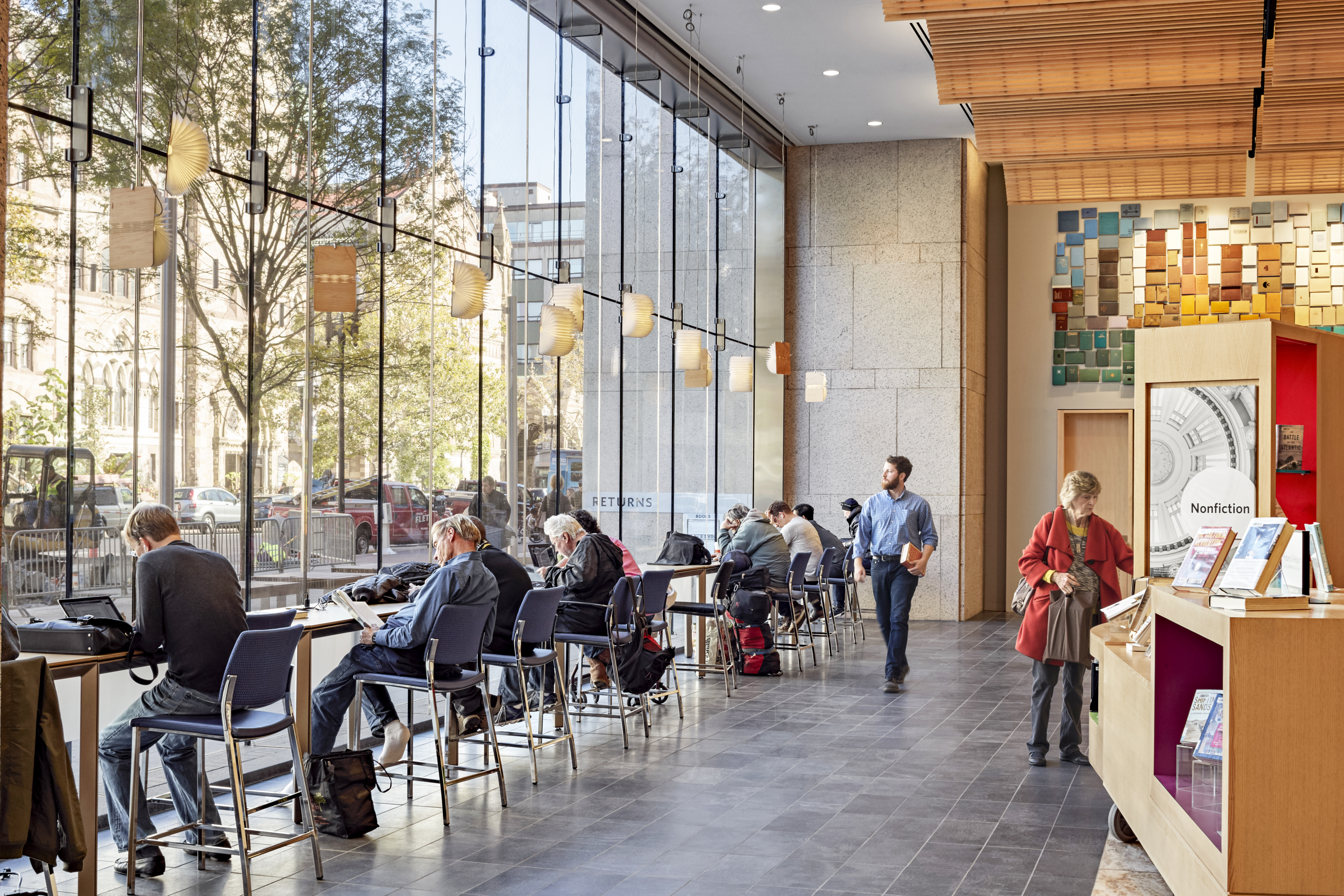
The renovation has changed the library into a “space for civic and community gathering,” notes Michael Coford, Director of Library Services. “Even with ample seating, there are many times when every seat is taken and visitors need help finding a place to sit. People are drawn to this new space, and once there, they want to spend the entire day.” He calls it a “democratic space, a comfortable space, an aesthetically-pleasing space … a communal space.”

The transformation fills a new public room with light and extends the library into the newly-defined shaded public plaza, with tables that encourage passersby to linger. The programming of the redesigned space was carefully considered to address 21st Century library patrons—from toddlers to adults. The doubling of collection circulation and visitor counts since the opening of the renovation highlights the patrons’ positive response to the new programming and redesigned space.
The building won a 2017 Charter Award from the Congress for the New Urbanism. “The design is compassionate,” says juror Daniel Solomon. “This is not about rejecting the previous generation. It’s adapting.”


