Designing missing middle for a small infill site
Note: This is Part 2.
In our previous post showing how we design Missing Middle Housing for small sites, we reviewed some initial steps, including conceptual studies for a small site master plan in Novato, California. Now, we’re going to look at the steps we took to refine the preferred alternative into something ready for entitlement.
Our initial concepts produced a range of discussion items—including the amount of open space, for sale or rental options, viability of live/work, and tradeoffs between yield and placemaking—and informed some key decisions.
Step 2: Site plan refinements with preferred type
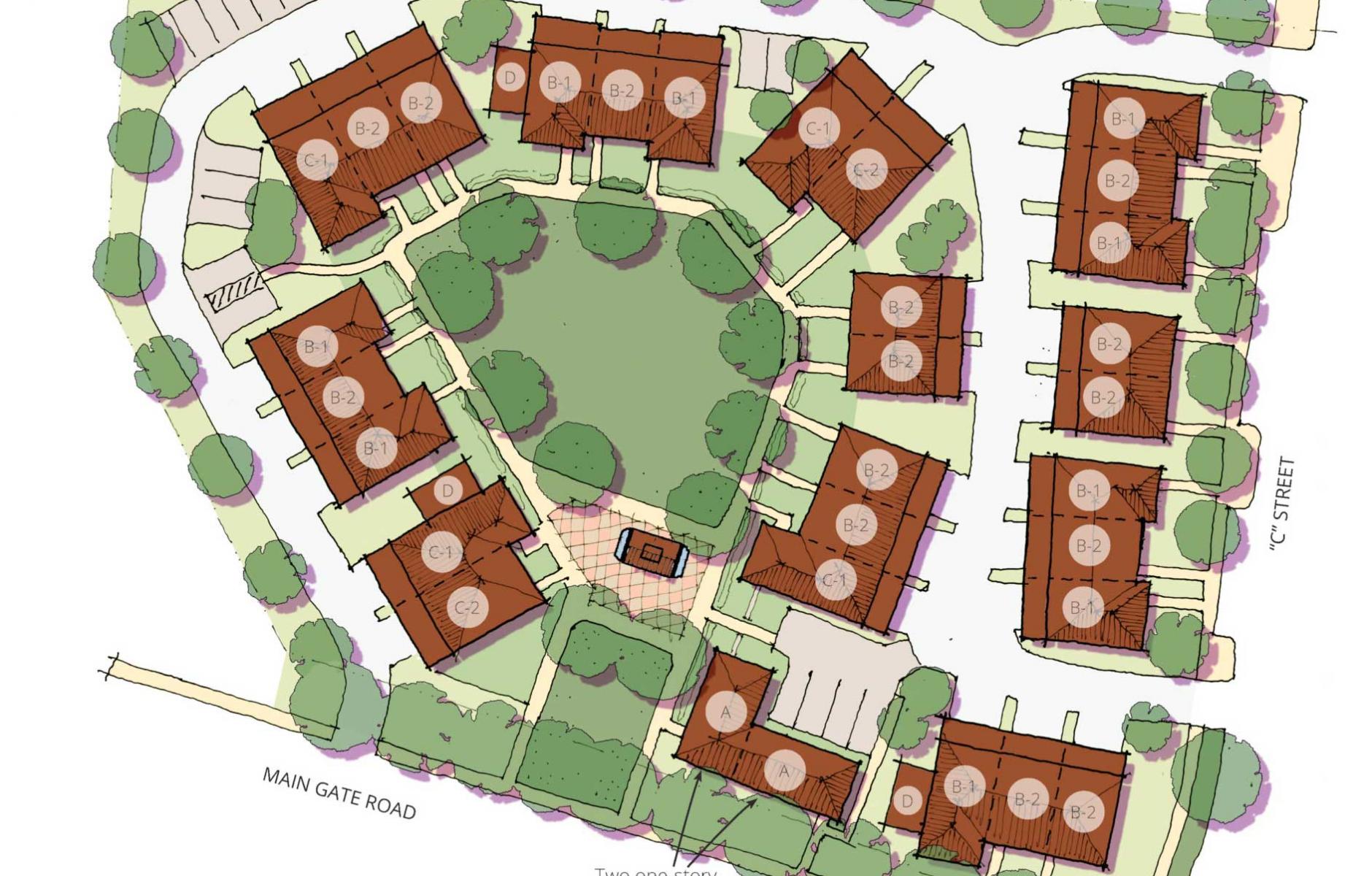
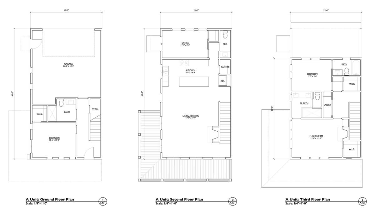
This is a simplification of the actual process, but at this stage the client selects a preferred alternative, type or mix of types, and we generate several refined alternatives to which the client can respond. Our client at this point selected the tuck-under townhouse type. This decision was primarily made because our client had decided to sell the site after getting the entitlement and felt that would be the easiest option to sell to another builder, even though the yields were not as high as other types. To site plan effectively with the tuck-under townhouse type, we used custom, three-story unit plans—three, to be precise, and none of which were generic—to generate building footprints, and we put forth the following options.
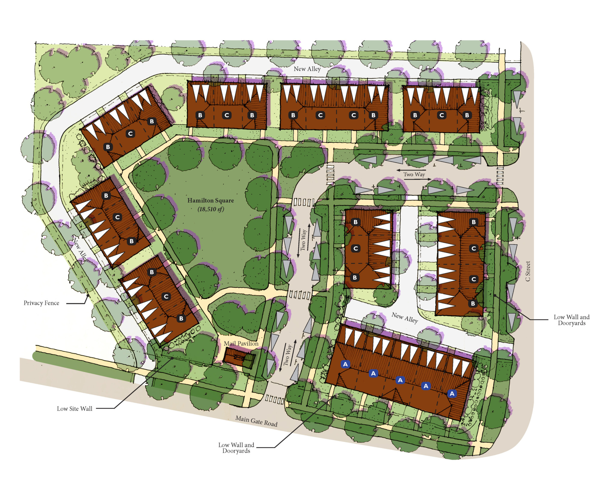
Option 2-A: Attached green with shorter internal street
In this option, we studied attaching the green on two sides and making the green bigger—18,500 square feet rather than 4,380 square feet in the previous schemes. We still retained an L-shaped internal street; this was only possible because it is a corner site.
There are a few Issues with this direction, including;
- Loss of the potential for future connectivity to site to the north;
- Less direct access for potential customers to uses within the live/work units, thus making their viability more challenging;
- Emergency access is more complex and challenging; and
- If biking or walking, you would need to go out to a busy road, versus staying on smaller, local streets as you could in the previous scheme.
That said, on a site this small, giving up the street was not as big of a compromise for us.
Program summary
-
Building Types: Tuck-under townhouses: a two-story type along the edges and two, three-story types internally
-
Program: 31 units, ranging in size from 1,700 to 2,100 square feet
-
Parking: 83 total on-site, 62 off-street and 21 on-street—not including adjacent on-street parking
Option 2-B: Eliminating the internal street
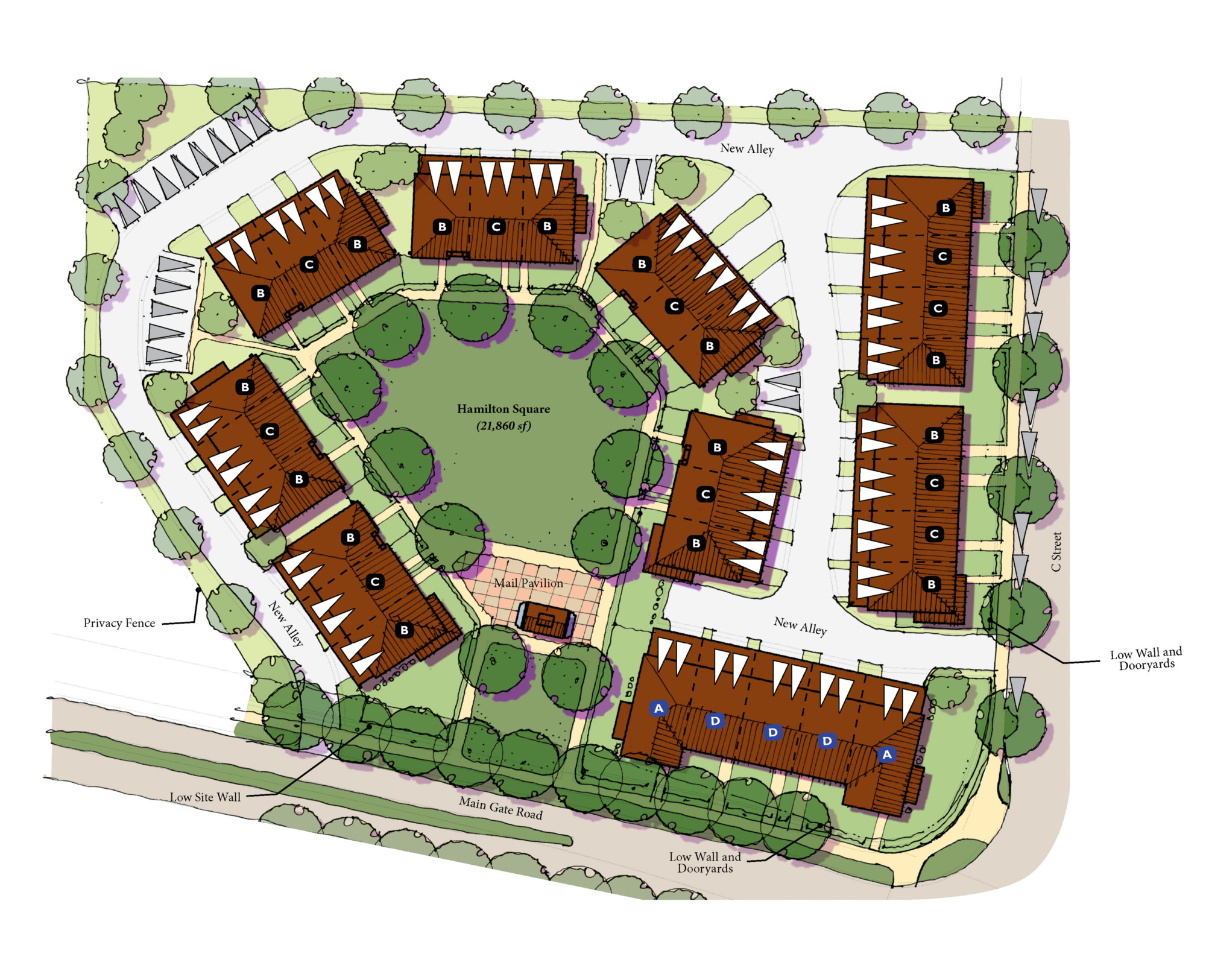
You have to be really, really careful about the decision to remove the streets. On sites of five plus acres, we will push hard to keep an internal street, but with a site this small, you are not really losing a lot of connectivity. On this site, eliminating the street allowed us to further increase the green size, from 18,500 square feet to 21,860 square feet, and changed the development model to more of a pocket neighborhood rather than a typical neighborhood with units oriented along a pedestrian-scale street.
An important note that should be true of all site plans, regardless of size of site, is that fronts face fronts and backs face backs on all buildings, and fronts of buildings address the adjacent streets. This is key to a good site plan.
A few other points to consider are:
- The alleys need to be narrow. The visual and physical “breaks” along street edges are minimized by narrow alley design and pushing buildings up to ROW of alleys.
- Orientation and engagement of the street frontages should be carefully considered even though most of the units are oriented internally onto the green.
- The entry into the square/green is off of the main road with a mail pavilion.
Program summary
- Building Types: Tuck-under townhouses: two building plans are three stories and a third is two stories to put along the edges
- Program: 31 units, ranging in size from 1,700 to 2,100 square feet. (Note: No units gained by removing the street—only gained open space)
- Parking: Two direct-access garage spaces per unit; 79 total spaces on-site: 62 open and enclosed, 17 uncovered. Loss of four spaces, not including adjacent on-street parking
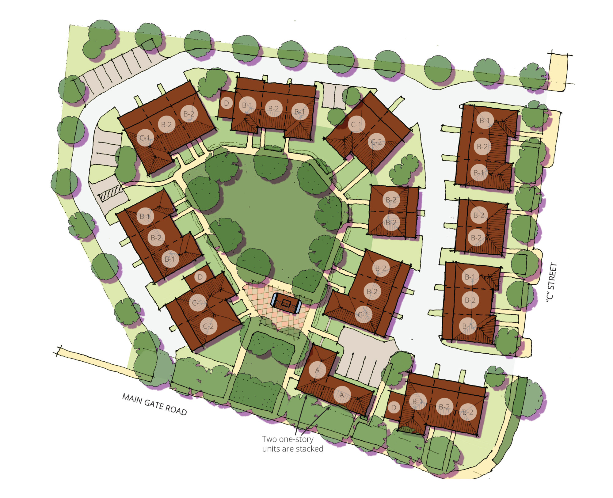
Step 3: Final adjustments
Over the course of time this was being approved, the market shifted dramatically toward wanting/needing smaller units and being okay with stacked units. Construction costs also increased, and the community and Design Review Committee (DRC) continued to push back against any three-story buildings. We were directed by our client to make the following changes while keeping the plan as close to the previous plan as possible:
- Introduce smaller units. This enabled us to hit two birds with one stone. We made the community and DRC happy because we brought all unit heights down to two stories, and it also allowed us to create more attainable units for buyers or renters.
- Introduce a few flats into the project. This also allowed us to create additional attainable units for buyers and renters.
- Introduce a 275-square-foot wing on a few buildings that can serve as an ancillary unit.
Final program summary
- Building Types: Five different unit types
- Program: 33 units, ranging in size from 880 to 1,622 square feet (1-3 bedrooms)
- Parking: 77 total on-site spaces. 58 off-street and enclosed; 19 uncovered

Final thoughts
You would think planning a 2.7-acre site for Missing Middle would be simple, but to truly capture value and create a great place, you need to set aside the time and budget to hire the right professional to enable you to get it right—a designer with an eye for balancing yield, parking access, public space, and placemaking, and one who has an intimate knowledge of a variety of building types, or even custom types.
Want to see the Missing Middle site planning process from start to finish? Download Daniel’s full white paper here.
You can also check out some similar site planning projects we’ve done:
This article first appears on the blog for Opticos Design.


