Better alternatives to Mr. Potato Head architecture
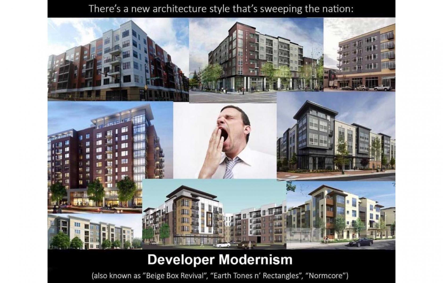
I recently criticized the architecture of multifamily buildings that too often prevails in US cities this decade. Materials and façade elements are often varied and juxtaposed in a way that is incoherent, and the buildings convey little order or sense of place. They look similar in Dallas, Denver, or Des Moines.
Atlanta’s Planning Commissioner Tim Keane, an urban planner with a master’s degree in architecture, calls them “Mr. Potato Head” buildings—after the child’s toy with mix-and-match features. Author Charles Siegel calls it the “break-up-the-box” style. An Internet meme dubs it “developer modernism.”

Whatever the name, I was asked for some counter-examples of recent buildings that don’t use this approach, and I put the question out to the Pro-Urb listserv. Although “Mr. Potato Head” buildings are (too) common, better recent residential buildings can be found in nearly every city or town. Here’s the Atticus Hotel in McMinnville, Oregon, designed by Nathan Cooprider. While hotels are commercial buildings, they also can be thought of as short-term residential. This could easily be a small apartment building.

Here is the Imperial Building in Albuquerque, designed by David Kim—also a four-story structure, with a Southwest desert flair (see also the photo at the top of the article). This building has a first-floor grocery store and 74 affordable apartments—better design doesn’t have to come with an excessive price tag.

Here’s the Arts Walk, loft-style buildings with artist studios on the first floor, near Catholic University in DC.

Here’s a four-story mixed-use building in Northampton, Massachusetts.
All of these buildings have unified facades that are well-ordered. They don’t try to look like multiple buildings or paste on pointless variety in a failed attempt to be interesting. They also manage to convey a sense of place.
In Atlanta, Keane has asked architects to “start out with a simple building design with high quality materials and amenities—rather than to add design features to make an ugly building better,” according to a recent report. “People in Atlanta don’t value design,” Keane said in a recent interview. He could be talking about a lot of cities. Here’s a before and after image to show what Keane is looking for.

“Keane wants our developers and architects to step up their game. And he’s willing to hold up their projects if they don’t live up to higher quality design standards,” according to the report. Cities can do better than Mr. Potato Head.


