Kentlands gets a downtown makeover
The test of urbanism is whether it can evolve and change over time, becoming more interesting with each iteration. Many early New Urbanism projects are beginning to molt and transform as buildings age.
Kentlands in Gaithersburg, Maryland, was designed in 1988 by DPZ and expanded in 1996 when a town extension, Lakelands, was planned. Market Square, the commercial center, also designed in 1996, served as a mixed-use destination for a generation of residents and visitors.
However, the architecture in Market Square was lackluster, and it was planned to eventually be rebuilt when the market supported more intense development at the core. While Market Square has an urban block and street structure and buildings mostly face the street, strip mall design elements are also evident.

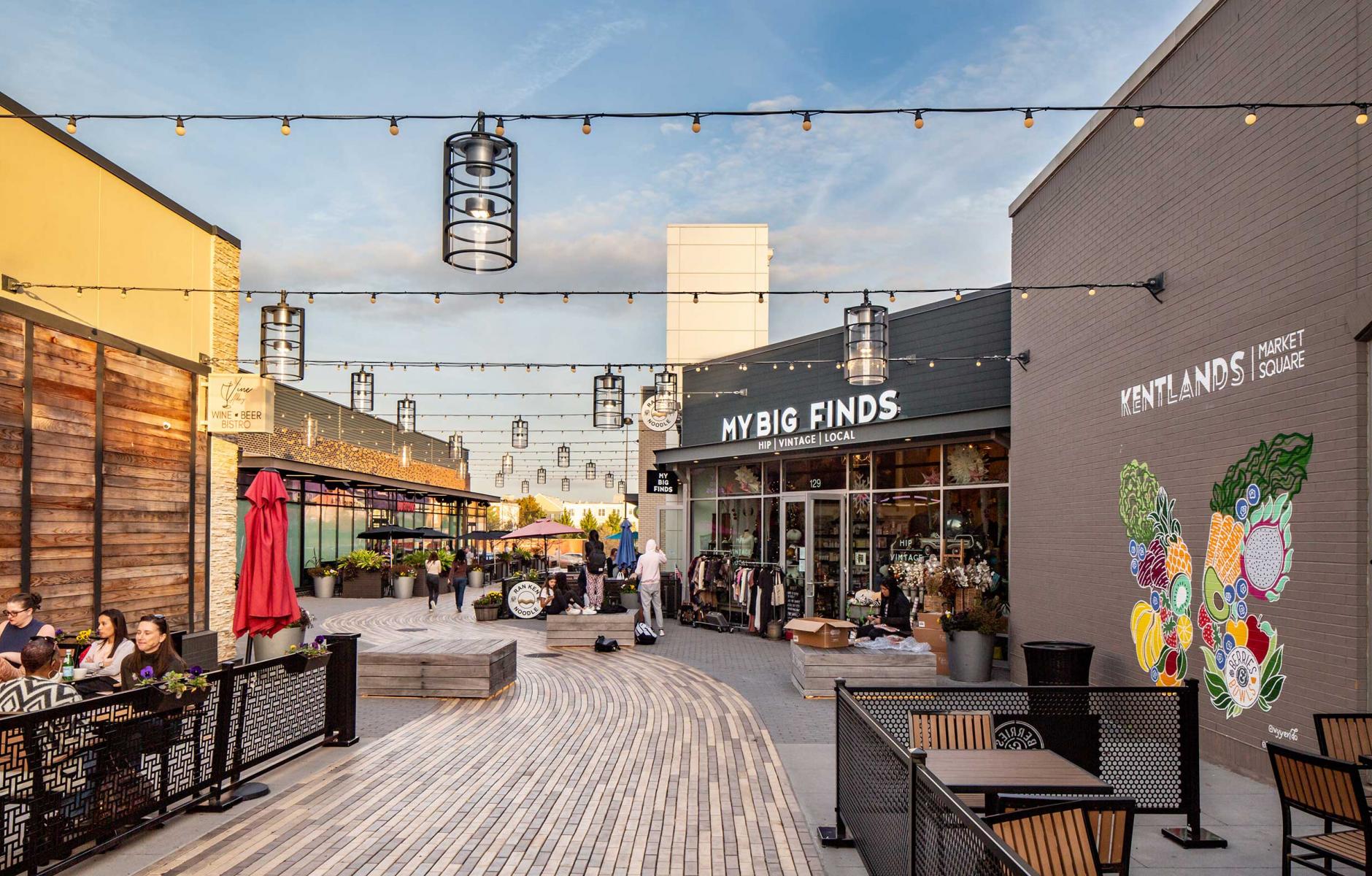
Redevelopment is already underway— MV+A Architects’ makeover of 2 acres of Market Square is making Kentlands’ downtown more compelling to walk and hang out. The coolest move was to build a paseo by cutting into a vacant, run-of-the-mill retail box that fronted a parking lot (see photo at top).
The project builds on a sketch plan adopted by the city in 2018, which is based on a 2008 master plan. It works “through a series of place-based interventions in the form of reconfigured open spaces, thoughtfully scaled façade treatments, and a viable mix of market-responsive retail configurations—anticipating the shift towards walkable, community place-making,” MV+A explains.
The project repositions the site of a former big-box retail tenant along with a variety of smaller, mid-sized commercial tenants, the designers note. “The decision was made to carve-out an opening through the middle of the big-box space, creating a paseo along which new, smaller in-line retail venues would be inserted. The paseo not only serves these new storefront destinations, but also provides the existing tenants along Market Street, to the north, with greater access and expanded street presence. Additionally, the paseo paves the way for the more porous, pedestrian-centric circulation patterns that will be required to achieve the master plan vision for a future Downtown Kentlands,” the design team says.
The designers started with “bland, stucco and storefront edifices.” They introduced new materials varying in color and texture to cultivate a sense of progression that occurs over time, contributing to a sense of place.

The project revitalizes a public space—a small plaza/green—within an adjacent block. It also revamps the exterior of a movie theater with a new entrance, adding an iconic “Kentlands” sign to a side wall. Another facade has fake dormers removed. The storefronts are updated with more pizzazz.
“As an urban design solution, this project takes on the suburban strip mall and converts it into a place for people rather than cars,” notes Jeffrey Huber, a juror in the Potomac Valley Design Excellence Awards “This is a great strategy and approach showing that design with a scalpel rather than a hatchet can have such a totalizing effect.”

When the plan sought approval, Rob Robinson, the city's long-range planning manager, noted, “The applicant’s desire to transform the existing development at the property into a walkable, vibrant, mixed-use community is compatible with the Master Plan’s vision for the Property.”
This project is the first phase of the downtown master plan, which envisions a transit-oriented heart for Kentlands, including many new living spaces planned, worthy of the title “downtown.” In the meantime, the new layer makes the place more attractive for pedestrians—showing the potential for urbanism to improve as it ages.


