Beauty is essential for sustainable cities
The motto of the CNU is Building Places People Love. To this end, New Urbanists have employed a variety of tools, but the one that’s rarely heard is the role beauty plays the built environment. Why is one of the most commonly used words in the English language not mentioned in the Charter for the New Urbanism? Because beauty is subjective. Based on feelings rather than facts, it’s impossible to quantify, but that’s exactly why it’s important. When we say a place is beautiful, it’s because we are emotionally engaged, the essential part of loving a place. This was born out in a recent study conducted by the Knight Foundation, where it surveyed 46,000 people from 23 different cities to see what they most loved about their city. They found that “social offerings, openness, and beauty are far more important than people’s perceptions of the economy, jobs, or basic services in creating a lasting emotional bond between people and their community.”
This disconnect between professionals and the public goes back to the 1930s when architecture schools replaced their Beaux Arts curriculums with Modernist ones. Based on the ideology of the Bauhaus, a German art school founded after World War One, it believed that the old order was passing and a new one emerging. Modernists called for a clean break from the past, which meant abandoning the study of precedent and composition in the pursuit of beauty for a functionalist ideology. As its founder, Walter Gropius put it, “a change is taking place in the conception of what is beautiful.” Modernists believed that machines and the scientific method used to design them were the ideal expressions of modernity. The architect Le Corbusier went so far as to claim that a house is a “machine for living.” Despite its limited palette, Modernism’s flaw wasn’t stylistic, it was ideological. Predicated on the idea that human nature evolved with technology, its adherents believed beauty was irrelevant in a science-dominated world. Fortunately, science has evolved beyond the primitive Darwinism of the time. Recent studies show that human nature is thousands of years old and that our emotions are integral to how we perceive our environment. To quote the neurologist Antonio Damasio, “people are not thinking machines who feel, but rather feeling beings who think.” This idea is key to understanding beauty's role and how reviving the art of architecture can help build places people love while addressing issues such as climate change and affordability.
Our planet is sick and getting sicker, resulting from development patterns we can no longer sustain. Sprawl is wasteful and detrimental to the health of our planet, which requires large amounts of undeveloped land to replenish itself. For nature to heal, we must reduce our footprint, which means abandoning some places while building up others to be more dense, sustainable, and beautiful. But what does beauty have to do with sustainability? People tend to save the things they love, so we must build places worth saving to reduce waste.
The problem is that people are suspicious of density. New buildings often ignore the character of their neighborhood, leading to resistance against all development. This is why the Preservation movement grew out of the 1960s when whole neighborhoods were demolished in the name of Urban Renewal. To build a denser future, we’ll need to have public support, which means giving people something better than what’s being replaced. As the National Trust for Historic Preservation put it in 1966, “The real value of any building to the community lies in its being a delight to the eyes and in its susceptibility to human use.”
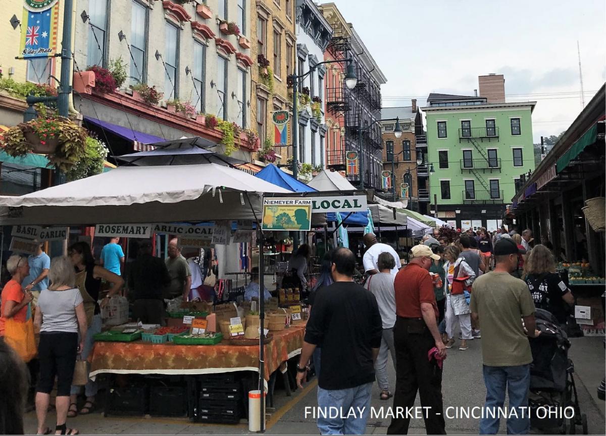
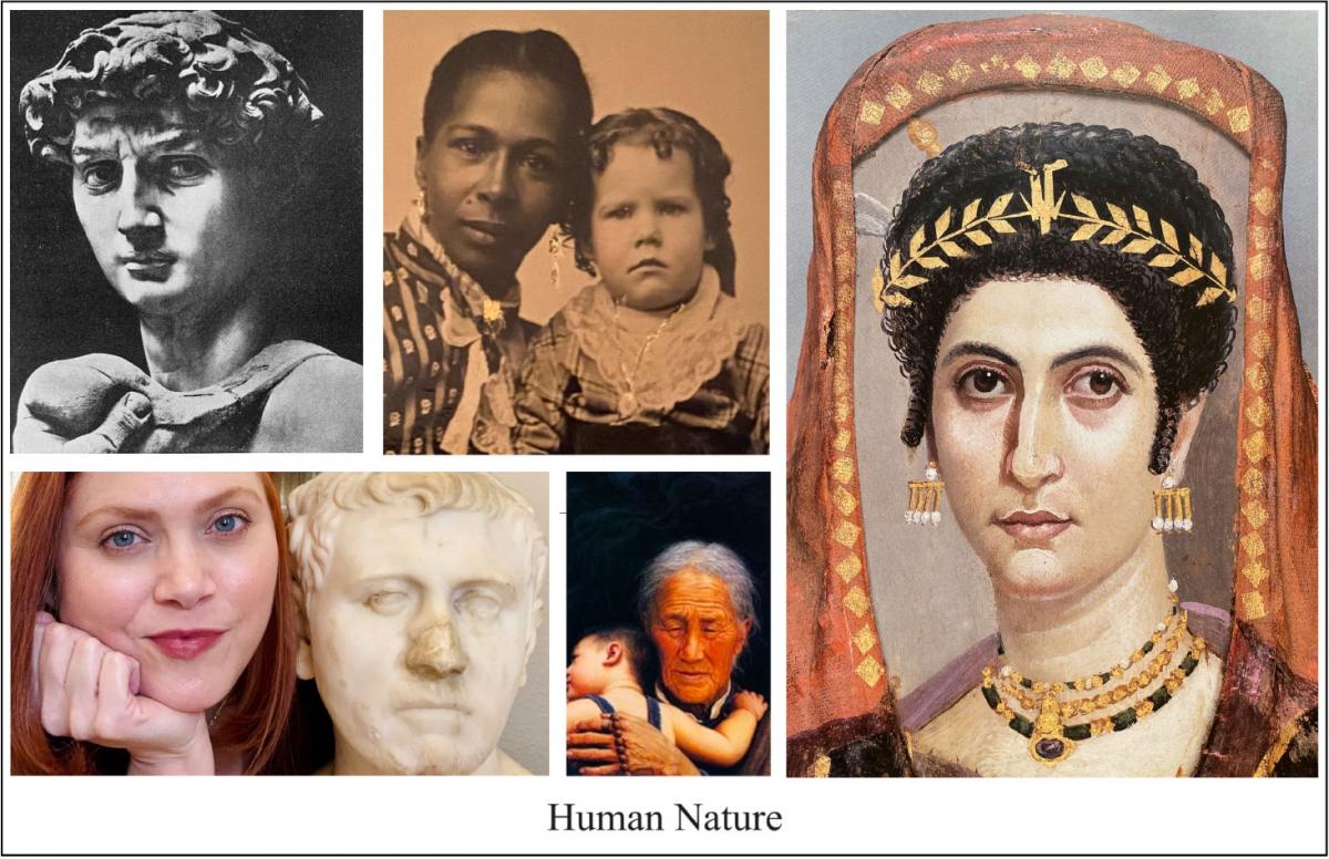
So, how can we get the composition study back into architecture schools? By articulating a vision of beauty based on human nature rather than ideology. The thing to understand is that beauty expresses how we feel. Whether we’re witnessing an act of kindness, realizing the truth, or gazing into a face, they can all feel beautiful. Neurologists have found that emotions are shorthand for determining if something is good or bad for our survival. Given the ocean of stimuli to process, it’s not surprising that we developed a system to quickly assess our surroundings. When Modernists dismissed beauty, they dismissed the way buildings make us feel, forgetting that the pedestrian experience is instinctual rather than intellectual. Unlike architects, people don’t think about what they see unless it strikes them positively or negatively. It used to be assumed that a building would harmonize with its neighbors as a form of manners, but today, we have to rely on aesthetic regulations to ensure a modicum of aesthetic harmony. This is what Modernists lost when they abandoned the study of historic buildings and cities, they lost the lessons of composition that make older streets so attractive.
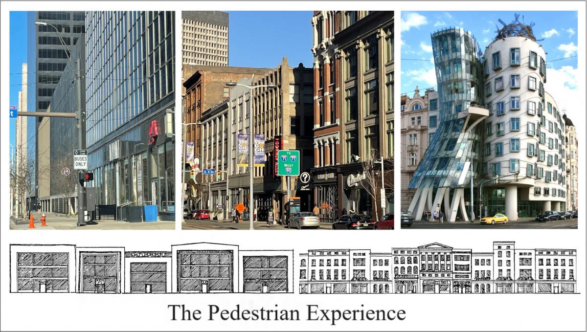
The pedestrian city is a city of facades, the quality of which affects how we feel. When confronted with blank or incoherent facades, the mind is alienated, but when harmoniously designed, the mind is pleasantly engaged. This is why the authors of a book on the Painted Ladies of San Francisco entitled it “A Gift to the Street.” Designed by builders who drew from architectural periodicals, their facades speak a pattern language that has become part of the city’s civic pride and identity.
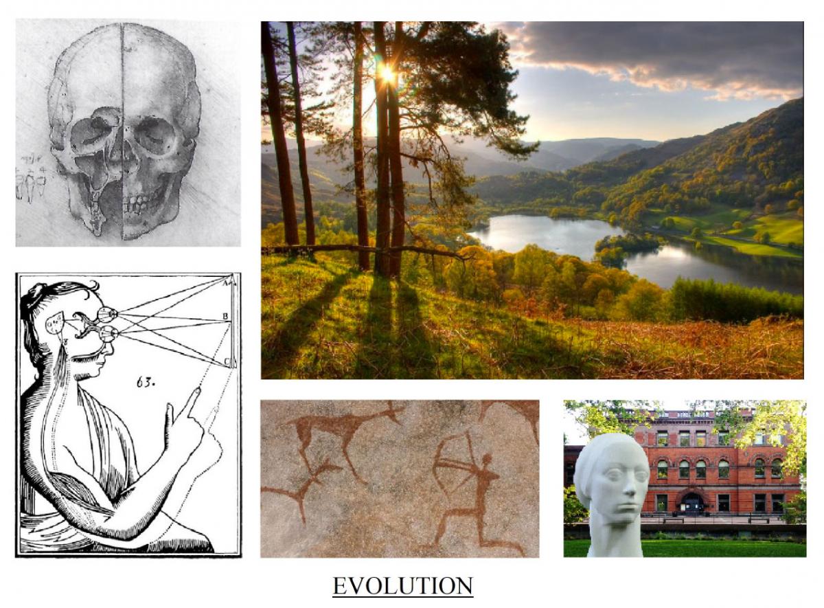
The mind evolved to read patterns as part of our survival instinct. This ability eventually grew into art forms as a way to practice and enjoy what each of us does instinctively. We often agree when something looks out of balance or not. This shared sense of perception is the difference between taste and how we evolved to perceive our surroundings, what sociologists call inter-subjectivity. Whether in a song, story, or streetscape, the more harmonious a composition, the more beauty we feel, even when we have no cultural connection to it. In neurological terms, this ability is called our Superior Pattern Processing, which some consider to be a defining feature of human intelligence and creativity. Because of the limited size of our working memory, the brain forms neural networks that light up when subjected to similar stimuli. These networks allow us to recall large amounts of information, especially when associated with an emotional memory. Even with fragmentary data, the mind creates a virtual model based on similar patterns. This is why historical precedent had always been a central part of architectural education. The more one studied, the larger one’s repertoire of solutions to recurring problems, be they aesthetic of practical. This is how architects trained their eye for harmonious beauty, what Michelangelo called “raggione dell’ occhio”.
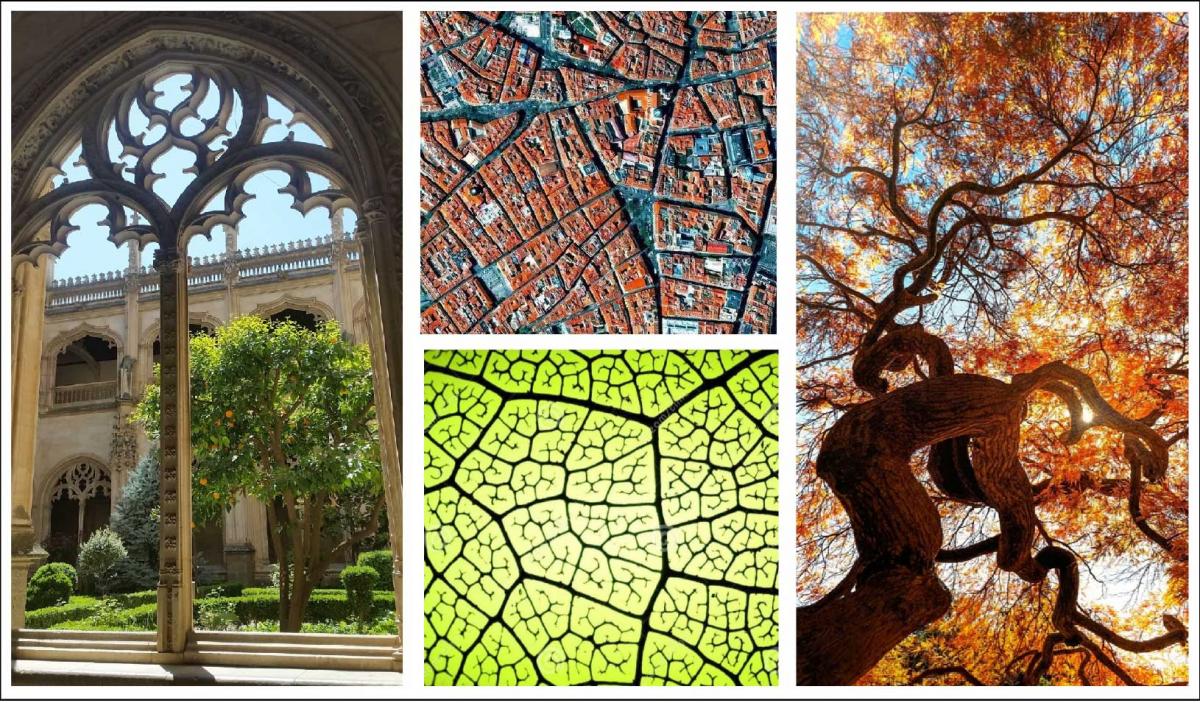
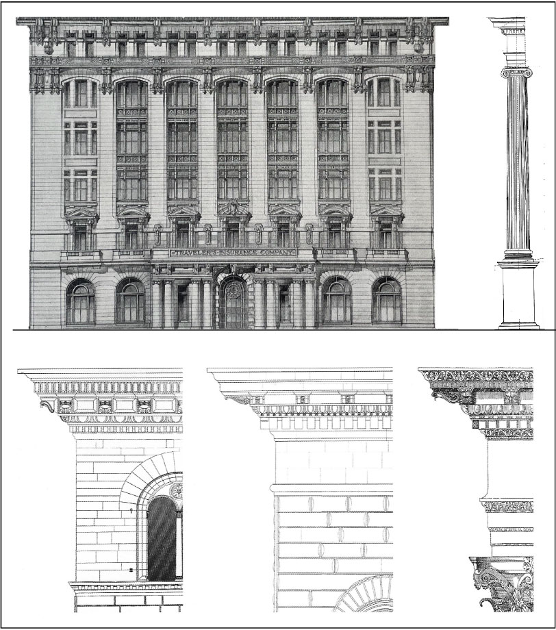
Recent studies have shown that the brain is most aroused by patterns with a 20 percent redundancy of elements similar to what we find in many traditional styles. Too much repetition is monotonous, while too much variety is confusing. Nature uses similar patterns to propagate life, what scientists call fractals. One can see this in a tree, whose branches relate to its trunk the way its leaves relate to their stems. Not only are these patterns strong, but they are malleable in the way they employ a common denominator. When we find unity within variety, the mind is pleased. Our attraction to traditional styles is akin to biophilia, and explains the saying that “art imitates nature.” Take a Classical building with a tripartite composition. The facade was often treated like an order, with the ground floor as a pedestal, the middle floors as a column, and the top floor as the entablature. Each of these could then be further subdivided depending on the scale of the building. Architecture has been referred to as frozen music because it uses similar principles of composition. As these pattern languages are repeated on a street and in neighborhood, one feels a symphony of delight. The fractal quality of historic styles allowed buildings of different periods to relate while also providing a sense of scale to the passerby. Even without ornament, a building’s openings can be arranged into pleasing patterns through principles of composition such as rhythm, scale, and proportion. These principles were well known before the advent of Modernism, when architects were expected to design in many styles. They also account for the timeless quality of buildings that continue to delight us long after they were built.
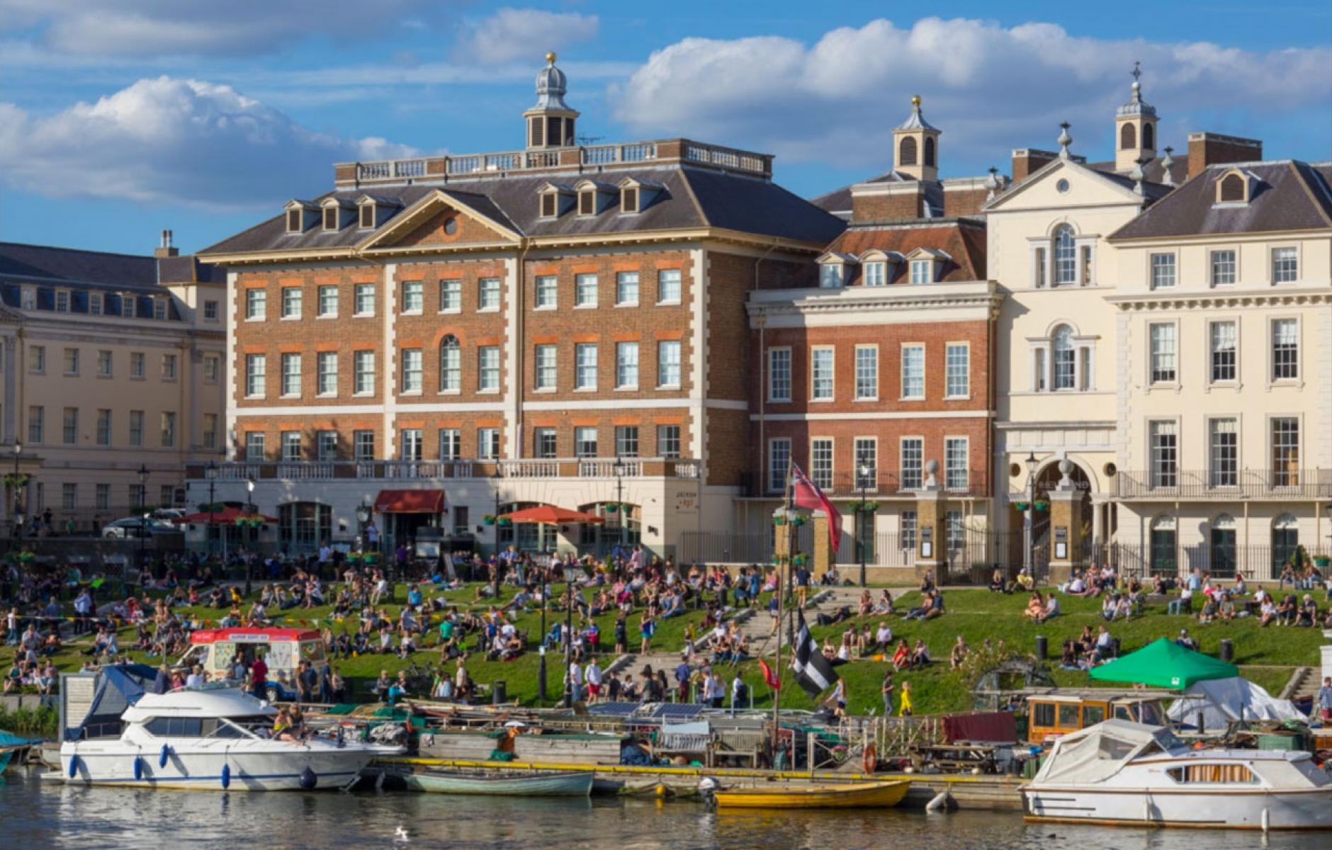
While beauty is in the eye of the beholder, it turns out that those eyes have a lot more in common than previously thought. Despite our differences in taste, it’s clear that people find some places more attractive than others. Why else would millions of tourists flock to historic towns and cities just to be immersed in their beauty? The answer is simple. Many of these places share a pattern language of details, materials, and compositional motifs that align with how we process visual information. As the Charter for New Urbanism puts it, “the best blocks, streets, and buildings in American cities are often the historic ones.”
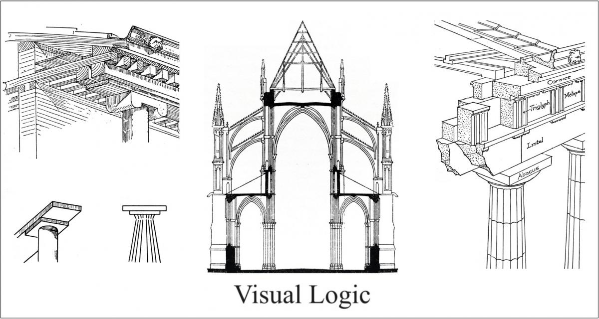
Another reason for the popularity of traditional styles is because of their visual logic. Having grown out of local building traditions, their details were often the result of structural requirements visible to the naked eye. Take a Gothic Cathedral, whose buttresses and pointed arches result from roof loads, or a Classical temple, whose details are leftovers from when they were built of wood. The mind is quietly reassured when things make visual sense. This results from mirror neurons, which respond to actions we see even when we’re not conscious of them.
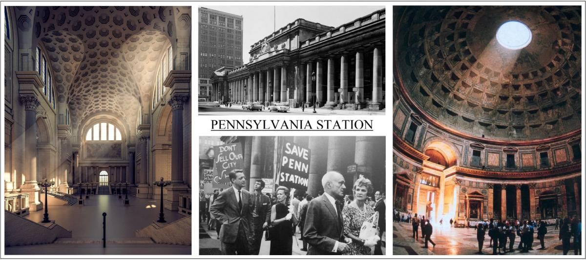
To illustrate the difference between how academia and the public view buildings, consider the demolition of Penn Station, which prompted the passage of the National Historic Preservation Act in 1966. Despite public outcry, Walter Gropius, who had become the head of Harvard’s Graduate School of Design, dismissed the efforts to save it, writing, “Why do we dissipate our strength by fighting battles for the resurrection or preservation of structures which were monuments to a particularly insignificant period in American architectural history, a period which, still unsure of its own mission, threw on the Roman toga around its lungs to appease its nagging doubts.” Compare this to what Austin Lord, the Dean of Columbia’s School of Architecture said about Penn Station in the 1920s. “I entered it some two years ago, a dark winter morning, at seven o’clock, and there was a light such as it exists in the Pantheon, that blue, purple dawn, scattering itself in those colors. I forgot myself. I forgot I was in this prosaic America, and standing before the man who was going to sell me my ticket, I exclaimed, ‘Oh! This is wonderful.’ Then I hesitated, somewhat confused, but I was agreeably surprised. The man said, “My dear man, I am the night ticket man, and that is what I sit up waiting for. Isn’t it beautiful?”
A recent study published in The New York Times found that people who experience beauty regularly are more open to strangers. It showed areas of the brain that are activated by looking at beautiful faces are the same as those that respond to other pleasurable stimuli. The pleasure we feel is the result of oxytocin, a hormone that promotes empathy, trust, and other pro-social behavior. Therefore, the more we design buildings to work together, the more people will be inclined to linger in the public realm and form the social bonds of community.
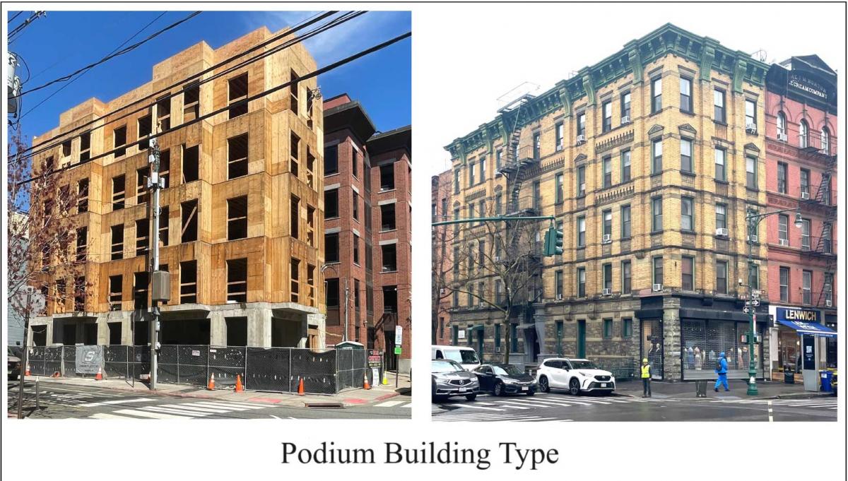
In the coming years, we need to build more densely, for which we’ll need to work with the building industry. Luckily, podium buildings are the same scale as some of our most attractive cities, with large parts built using pattern books and form codes. Not only are their walk-up buildings dense, but they don’t need a lot of design to create a great street, as long as they are well composed. Even when we can’t afford quality materials and craftsmanship, good proportions are free as long as one has trained their eye, which brings us back to the problem of NIMBYs. I experienced this firsthand designing a block-long apartment building in Alexandria, Virginia, a Colonial town that requires public approval for new construction in the historic district. My boss told me to design a glass building, which was promptly rejected. I was then told to clad it in brick, which was also rejected. Finally, the client was getting impatient, so I was told to design anything that might pass. I broke up the block with various facades drawn from the surrounding neighborhood, and the design was quickly approved.
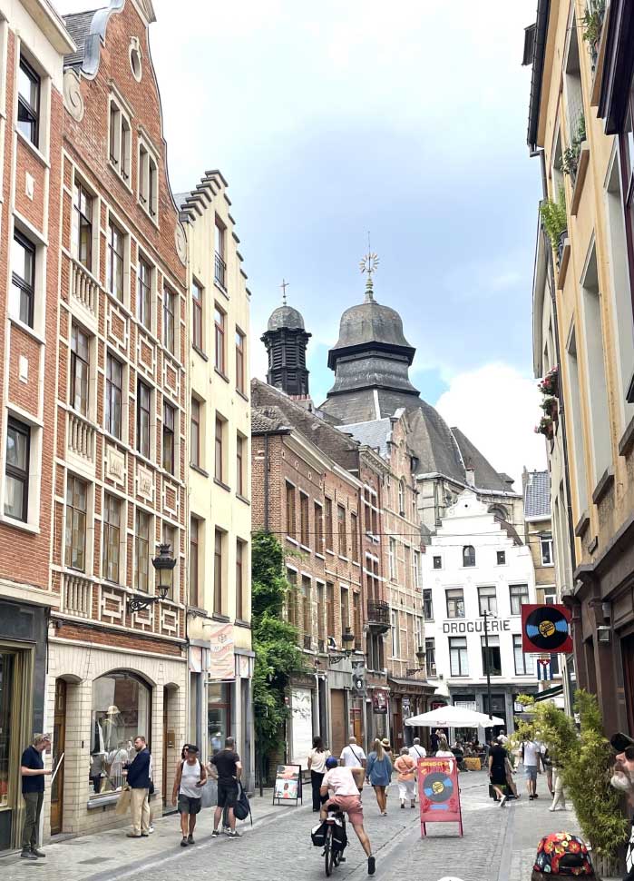
A town architect once told me there was a huge demand for architects who could design ‘authentic’ looking buildings. Imagine the great architects of the past worrying about authenticity. Better yet, imagine what our towns and cities would look like if we trained architects to design buildings the public might like. The Charter for the New Urbanism describes its goal as, “an attempt to pick up the threads, so recently abandoned, of this 5,000 year old craft of building towns and cities,” so why not revive the ancient art of architecture that built these towns? Without the beauty that makes cities a pleasure to walk in, we will never build places worth preserving, but if we design for it, not only are we more likely to get it, what we build today will stand a better chance of being reused tomorrow.


