Bringing back the lost art of Main Street buildings
All over America, commercial districts are filled with small, 2- to 3-story buildings with commercial spaces on the first floor below residential units. These standard Main Street buildings, often made of brick, have been dubbed “live works” in recent decades.
Live-work buildings are like mixed-use townhouses. Because of zoning restrictions and a lack of developer familiarity with the type, they are not commonly built in cities or towns today. But they have been constructed in many walkable new urbanist communities, notably Norton Commons in Louisville, Kentucky.
“The live-work has been an immensely popular building type in Norton Commons throughout the build-out of the community,” says Anthony Catania of AMC Architecture & Design, who designed a recent row in the North Village of Norton Commons. You can also find this building type in multiple locations in the South Village, which is finished. Norton Commons is a large traditional neighborhood development (TND) in suburban Louisville that won a Charter Award in 2019.
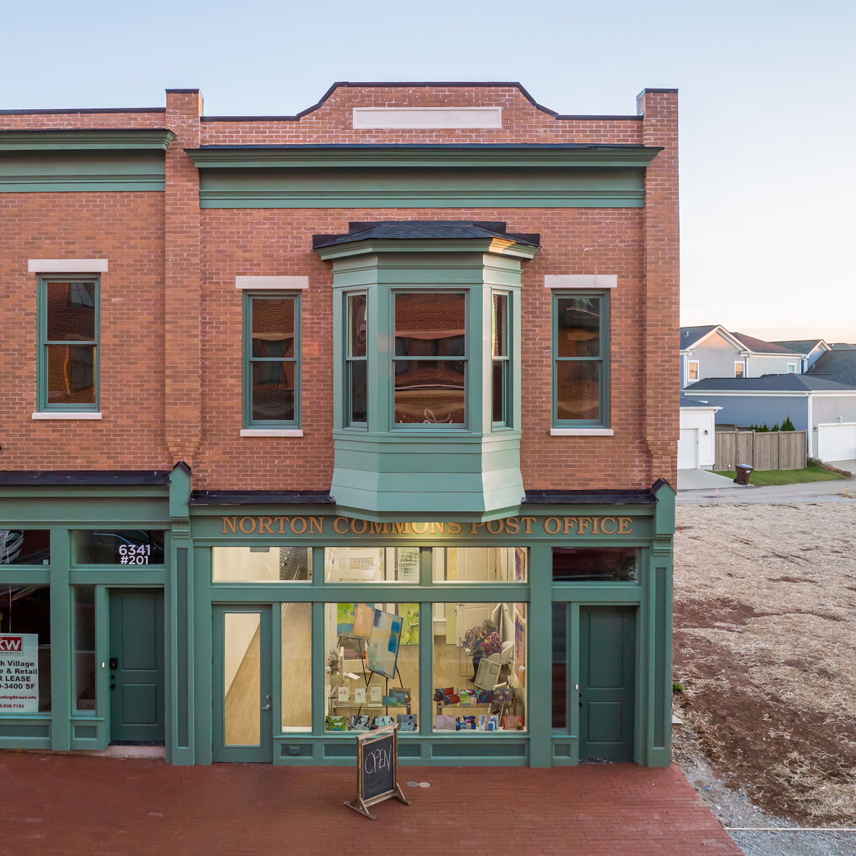
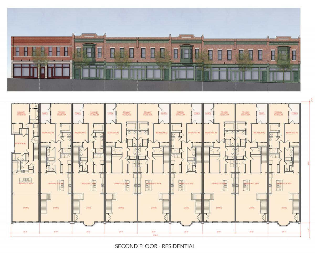
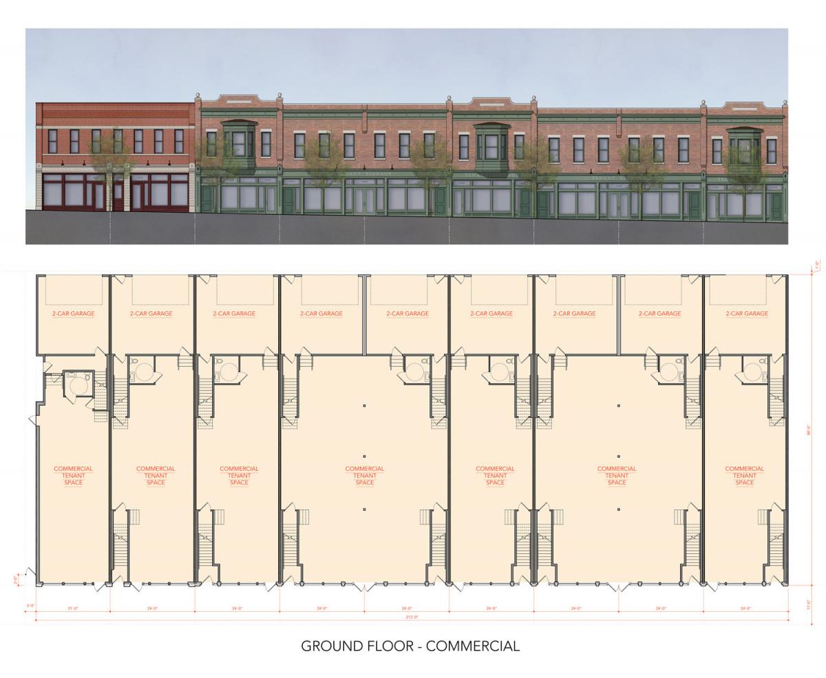
Catania’s half-acre row offers substantial density at a 2-story scale. The row includes seven first-floor commercial spaces and nine spacious townhouses averaging nearly 2,000 square feet each. The project looks great at a construction cost of just over $200 per square foot. “The overall construction cost was approximately $6.4 million; it includes 13,600 square feet of commercial and 17,600 square feet of residential space,” Catania explains. “The project is located across the street from a large mixed-use building and less than a block from the North Village Square—the commercial center of the North Village of Norton Commons.”
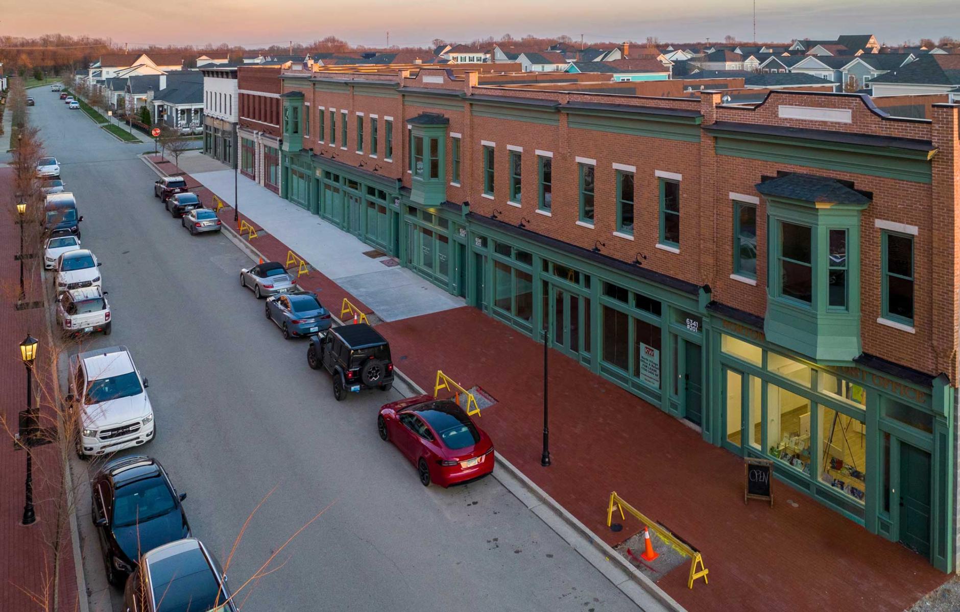
These kinds of buildings make attractive background buildings in cities. Live-works facades are often individually designed; in this case, a consistent architectural language was employed for the block. “The goal was to demonstrate that you can create a ‘long building’ of a single architecture, but execute it in a way that maintains a human scale through composition, rhythm, and detailing,” Catania explains.
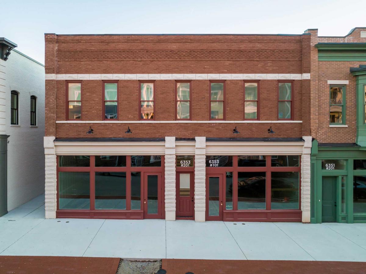
The inspiration came from historic buildings in the Ohio River Valley. Two distinct facade types were used, Catania explains.
“Façade Type A spans only two lots to respect the scale of the existing live-work next door, as well as the transition to single-family homes on the next block. This façade type is highlighted with the use of ‘pitch-faced’ stone elements and corbelled brickwork. It features a molded red brick and draws from late-19th-Century precedents that utilized the manipulation of masonry to abstract classical building elements. Façade Type B is closer to the more intensive commercial core of the neighborhood and spans five lots. This composition incorporates the two double-wide lots in a rational manner that creates overall symmetry at this façade type.
"This design includes a more refined iron-spot brick and classical design elements, such as the entablatures and the projected bays. These second-floor bays are an important design element, as they provide views for those premium apartments down the street to the North Village Square, as well as providing balance to the overall façade. The stepping of the buildings at property lines created a challenge for the interface of entablatures, string courses, and storefronts, which was handled with the use of piers and corbels. These piers and corbels punctuate the façade and create a distinct rhythm that is critical to breaking down the scale of the building. Special attention was also paid to the design of the storefronts, maximizing glazing at street level, while still providing adequate ‘visual support’ of the brick above.”
