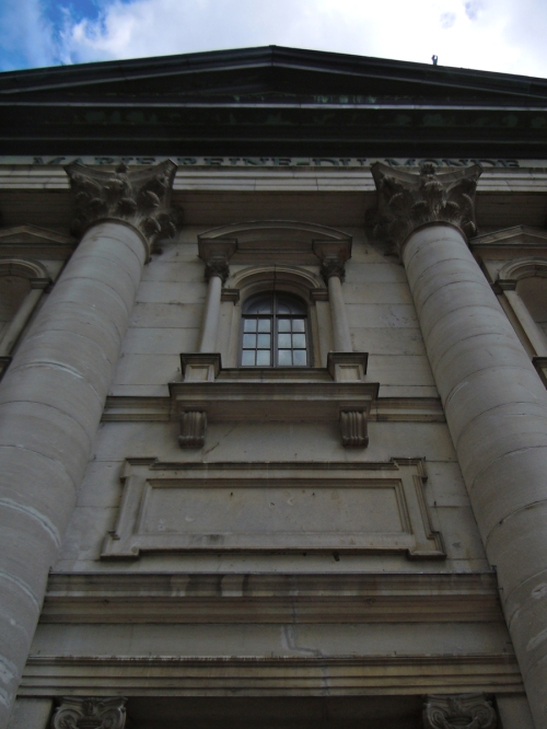
Montreal: Lessons from great Canadian urbanism
Ever had a teacher who was so amazing at storytelling that difficult subjects become clear – and riveting? Some of my favourites that come to mind are Professors John Kraus and Robert Garbacz on electromagnetics, and Andrés Duany and Léon Krier on urbanism. The last few days, I’ve spent some time in la belle province, and I’ve felt that the Ville de Montréal is such a teacher.
Many of the design and legal issues we often discuss here on PlaceShakers, Montréal makes quick work of with some telling images. Heading on to Mont-Tremblant and Ottawa next, expect this to be the first in a series of three collections of insights from some great Canadian urbanism.
Cycling City
Outside of the fine-grained street networks and amazing architecture, the next thing that strikes me about Montreal is the exceptional cycling culture that seems to have taken over the city. The bikeshare seen here is empty, so perhaps the only complaint is getting the supply (5000 Bixi bikes) up to the increasing demand.
Downtown has given over an entire lane to a curb-separated bikeway, which is supported with bike-friendly signage and signals.
Repurposing
Recently I’v complained about façade-ectomies in other cities. Rarely have I seen a North American city go to such great lengths to repurpose entire structures. This building is an extreme example, wearing its archeology as a badge of courage, marking time over the 1700′s, 1800′s, and 1900′s.
Carefully referencing the massing of the repurposed apartment building next door, the new wing of the art museum fits in.
Permanent pedestrian streets
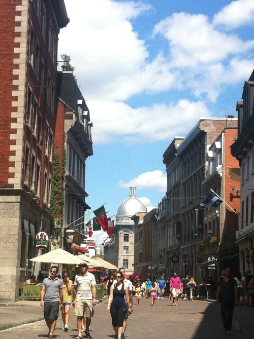
Scott Doyon recently pointed out the challenges of pedestrian malls, along with the places in which they work. Montreal is clearly such a place, with large populations of in-town housing, four major universities, and tourists. The permanent pedestrian streets here clearly work, including Rue Prince Arthur Est pictured here.
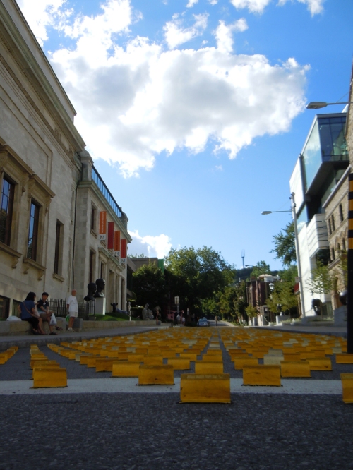
Some of the permanent pedestrian streets here don’t behave as malls, but rather playful art pieces, like these 3,500 temporary overlay markers by Claude Cormier. Later this block will become a permanent sculpture garden. Usually we’d complain about clipping the street grid like this, however the grain is so fine here with large percentages of people on foot, it works. As does this similar treatment of outdoor seating under purple trees by the beautiful McCord Museum:
Monocultures rarely work, and while a well-done pedestrian street is satisfying, I’m wondering if this allee through McGill University really needs to ban cyclists? The cyclists clearly don’t think so.
Pedestrians of haute couture graced the streets during last week’s Festival Mode & Design.
Temporary pedestrian streets
Closed to cars from 17 May to 23 September, some great temporary pedestrian streets team with life. Others close for shorter periods to handle the large numbers of pedestrians drawn by summer and festivals.
Simple public space
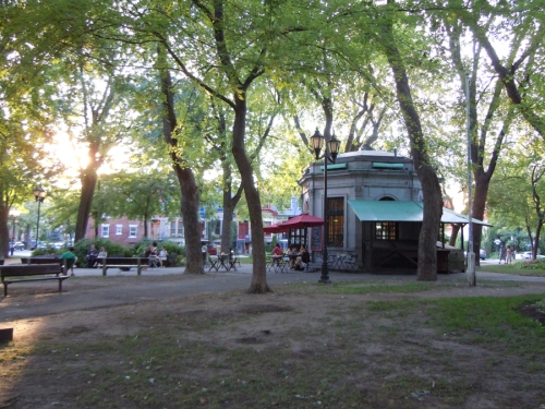
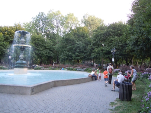
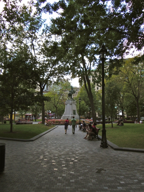
However tempting over-programming public space may be, simplicity makes a strong case for livability. Montreal plazas and squares satisfy basic needs for shade and rest, then save their investment for one central iconic feature, like a fountain or a small café. The results are timeless and so pleasing that the grass doesn’t always have to be perfect.
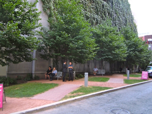
This well-used pocket park keeps it simple, offering shade and a bench on a hot day on Rue Drummond between Boulevard de Maisonneuve and Rue Sherbrooke
Terminated Vistas
Earlier this year, we discussed the terminated vista. Montreal elevates the conversation.

Terminating the vista of Rue Saint-Denis, Notre-Dame-de-Bon-Secours Chapel overlooks the water and is dedicated to sailors
Century Material
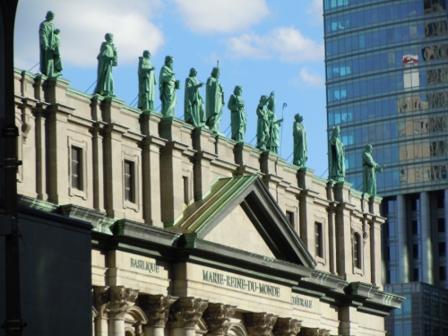
Early on in this conversation we discussed repurposing. To make capturing the embodied energy in a building a possibility, we’d have to start with century material in the first place. Buildings that are intended to last upwards of 100 years are found in abundance in Montreal, and a few of them were built in the 20th century. The 21st less so, but here’s hoping for a return to permanence.

Saint-Joseph du Mount Royal construction was inaugerated in 1924, and completed in 1967. Well worth the wait, and the 516 steps to get to the top!
Recommendations
Thanks again to Montreal and its planners for some delightful lessons learned. Definitely worth a visit, and if you’re heading this way soon, you’ll want to try some of the food that is as timeless as the urbanism. Around for decades with thankfully very little change, L’Express, Laloux, and Duc de Lorean were my favourites. Also worth a visit is the Star Wars show at the Science Museum and the Biodome. Both aimed at children, our 7-year-old enjoyed the shows, however at the end of the day, preferred riding the Metro and bus system and walking the streets, along with the visit to Saint-Joseph du Mount Royal. Just as with the urbanism, the bells and whistles are rarely as valued as much as the permanence. Even if you’re seven.
Hazel Borys is principal and managing director of Placemakers, a planning, coding, marketing, and implementation firm. This article originally appeared on PlaceShakers and NewsMakers.
For more in-depth coverage:
• Subscribe to Better! Cities & Towns to read all of the articles (print+online) on implementation of greener, stronger, cities and towns.
• See the July-August 2012 issue of Better! Cities & Towns.Topics: Urban retail, Street fear in new urban neighborhood, Subdivisions without a pulse, Walk Appeal, Pruitt-Igoe, The neighborhood hardware store, Columbia Pike in Arlington, Urban and environmental e-books, The Economics of Place, Design After Decline, Urban thoroughfares
• Get New Urbanism: Best Practices Guide, packed with more than 800 informative photos, plans, tables, and other illustrations, this book is the best single guide to implementing better cities and towns.


