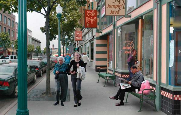
Ten rules for successful storefront design
Editor's note: The following is an excerpt from an e-book, The Ten No-B.S. Rules for Successful Storefront Design. If you are a retail or restaurant entrepreneur, reading the entire book is highly recommended—it is full of excellent advice. Download here.
1. Create a vision
You are a small business owner. You have saved, borrowed and worked hard to open a store. You are nervous about getting customers. Take a reality check. Go out to see what others are doing. Look for closed stores and try to connect dots. Is there a pattern to why they had to close down? Most likely yes.
Ideas are unstoppable. Focus on the strongest one you got and align each and every design, service and outreach strategy towards achieving that goal. Trusted brands become good friends. Think of Apple, Nike, or Toyota. Customers are proud of using their products. Make your customers proud of patronizing your store.
Aim to become the hub for people to meet and gather. Engage the sidewalk, the block and the neighborhood around you.
2. Polish your storytelling
Create the story that will guide your design, your service ethics, the mood and the experience of your store. You have started with your vision. Now give that vision a face, a personality, needs and desires.
To find a well told, honest story that people can connect to, look at your process. If you manufacture something, think of people who make the parts and how they relate to your finished product. If you sell something, think of where it comes from and sell the importance of its origin.
Write up your story. Focus on what you will offer and how each customer will live a unique, customized experience. Add drama. People crave it. How it spices up your story is up to you. In this manual you will find the tools you need to translate it into design. We all like a good movie not so much because of what is shown but because of how it made us feel.
People buy on emotion and not logic, a wise man once told me. Connect with your customers and potential customers using that. Pro tip (from the same wise man): Fear of loss is more powerful than pleasure of gain.
Now for the hard part: make your story fit in a napkin. Keep it short, simple, straight to the point.

3. Design for engagement
Customers these days don’t buy products but experiences. Provide an unforgettable one. If you are a restaurant do not focus on selling food but rather on how people feel when they eat at your place.
If you sell clothing do not focus on pants and shirts but on an ideal lifestyle to which they can access by wearing them. The goal is to make people have a personal relationship with your brand.
If you align your vision, your story and your service with the type of experience that you offer, the design will flow naturally.
You’ve thought of an idea and made a story around it. This is where colors, materials and textures help you engage your customers. Will you pull it off if you use plastic or aluminum chairs? Or do they have to be wooden? Will white walls do the trick or do they need to be a medium-dark gray?
To create an experience, you have to stimulate all five senses. Create a mood by using color and texture, but also think of sound or music, make the store smell a certain way and use lights to top it off.
Good design guides the customer. Think of how they will stand in line at the register or what they face when they sit down. Study how changing the experience of personal space can aid your brand. How much do you want people to engage with each other and with your store?
The good news is you control the space around tables, along alleys and in workspaces. The design of your store, restaurant or cafe will drive traffic, will motivate potential customers but only patient and careful activation will make it work 100 percent.
Plan events, participate in fairs or temporary markets, have providers do special activities in your spot, bring interesting pop-ups to share your space.
4. Make it look like your concept
When you prepare your design, refer to your vision and ask yourself the question: Will this decision be in line with my vision?
Answering might be a bit tricky but here is a checklist of some things you might want to consider so that your hard work doesn’t get wasted on a great looking store where no one goes.
Your store has three main parts. First is the storefront, which is made up of the facade, the entrance and the sidewalk.
Bear in mind that as important as the sidewalk is for your business, your control over it can be limited Always refer to your local code.
An appropriately designed storefront will make people stop walking, it will interest them to look in and engage them long enough to motivate the decision to step inside. It is arguably the most important part of your store’s design.
Second is the display window. Technically this is a separate design entity but is actually part of the storefront. It is the set where you show your products or your craft or present your work process as a tool for engagement.
Finally, the interior, which is equally as important. It must be consistent with the storefront and be aligned with your business’ work and service ethics.
Tell the same story outside and inside. Your concept is strong. It guides the design of the whole store.

5. Meet the sidewalk
How the storefront meets the sidewalk and transforms the frontage into a semi-public space where people feel compelled to stop will distinguish a good design from a not so good one.
Set up an outdoor living room. This is where people will hang out and be engaged. Many will become your customers. Imagine a small park in front of your door where people can sit and become friends with your brand.
Or perhaps a dynamic display window where you show how you make grandma’s ravioli or display your finished crafts for people to interact with as they walk by are great examples.
To design the storefront, you can use any or all of the design elements, some of which are discussed in this article (and more in the complete e-book). People are visual and want to feel comfortable.
A good way to meet the sidewalk is to make people slow down from their normal walking speed. Be bold, but do not scream. Subtlety will win more gazes.
Once they have stopped and they look in, design has done its job. Now it is yours to entice them to step in.
6. Let people sit
People attract more people. Let people sit even though they do not patronize the store. Becoming a neighborhood hub, getting attention and receiving free word of mouth promotion requires becoming a public space. Here are a few pro tips.
Build community. Offer your space for meetings, put out extra chairs for holidays or parades. Bring out a watercooler during the summer or offer free coffee in the winter. Be known for your generosity.
Doesn’t matter the type of seats. They could be formal or casual, fixed, heavy, concrete seats or even beach chairs. The goal is to get people sitting outside.
Any type of seat will do but not any arrangement. Seats must be arranged around a center. Make people look in each other’s eyes when they are sitting down. Building community is also about connecting the community and facing seats are a great way to do that.
Bonus: when you do this, you increase your chances of becoming the neighborhood hangout. Use it for your advantage. The more people crowd your store, the more interesting it looks.
Or you can play the exclusivity game. Put out one single table and two chairs. Sitting at the only table you provide should feel like a privilege, a glitch on your offer that someone can snatch, an exclusive event.
Whatever tactic you choose, make sure seating outside of your storefront at any hour feels like an event, an artistic performance, even.
7. Be transparent
Some storefronts are blessed with lots of facade windows. Using that transparency to your advantage is easy. Make things happen just on the other side. Things that will interest people who walk by. You’re putting on a show.
You should aim to reach a balance between the outdoor living room, the display window and an interior “focal point,” which is an important element of your design.
Surrounding people with the whole experience will have a better chance of turning them into customers by catching their attention, making them look inside and motivating their stepping in and patronizing your business.
But transparency is not all about windows or how far inside can people look. It’s about being honest about your business and letting people see how important it is and how much passion you are putting into it.
Transparency makes use of design to open up your trade, tell your story, introduce those who toast and grind the coffee, process the linen sheets, or make the hats that you sell.
Each important point in what you do, each important part of your process can be translated to an
important corner of your store, what we call “focal points.” The number of important focal points will determine how many times people’s gaze stops while visually scanning the inside of your store.
Each focal point should be strong, unique, easy to find, and lead on to the next, going as far back into the store as possible. Design each focal point as a “station” that showcases your products or any other highlight before arriving to the main focal point.
You want to maximize the number of stops but make sure they arrive to the last one, which should be memorable, unforgettable and should leave people talking about your business.
8. Send a loud and clear message
In the 1960s, a famous media analyst, Marshall McLuhan, said that “The media is the message.” This means that how we present things is as important as what we present.
Every step of your design, from the layout to the displays, cash register location and service should be part of your story.
Graphics are a critical part of this process. Graphics make your message literal and help you broadcast it. The design of graphics should be pursued as responsibly as the design of the store.
Choose the right type of sign, graphics and fonts. Align everything to your vision. What do you want to say? How does the store’s name and logo support that?
Look at how different signs help or harm the type of business they represent. Can you read the letters? Do most businesses in an industry have similar letters? Is there a standard for naming, writing and supporting storefronts? How does the store layout and design support that?

9. Design with proportions
Every detail in your store will be measured against all others. This means that if shelves are too high or too thick, your products might not display well. To fix that you must change the size of your furniture. Getting that wrong will affect the circulation inside the store.
Customers will feel uncomfortable in a store that has poor proportions. It is extremely difficult for a person who is not familiar with the design process to be able to pinpoint what is it that deters them from shopping in a particular store, but the feeling of discomfort is primal, real, and bad for sales.
Even the most experienced architects and designers often get those wrong so don’t feel bad. The good news is that you can take control of your design. Consider what you are working with and cannot change: height, width, and length of the store—and measure everything considering that reality.
First measure every major element of your space and calculate every other detail in relation to those measurements. Measure shelves, furniture, and any other object and check that they fit in your space and won’t affect the circulation inside the store.
Get used to measuring ratios. Signs can easily be overestimated and so can furniture, ceiling, awning, and lamp heights, the size of light fixtures or the width of walkways.
Draw everything. Learn how to do section and plan drawings using Francis D.K. Ching’s “Architectural Graphics” or follow free YouTube tutorial. Learn how to draw in SketchUp which is a free 3D modeling software from Google. You will see proportions as you draw and your spatial perception will be heightened.
If you have any control over how your façade looks the best advice is just go out and look how other commercial facades work and ask yourself: Why? Walk on as many Main Streets as you can and record what strikes you as good, useful and successful.
Write down the significant mistakes that you can find. Sample seats and check awning heights, look inside and note the types of lights. Come back with an idea of what you want. Then check Pinterest and Instagram. The best source of current excellent storefronts for people who are designing their own is social media.
10. Brand it
Integrate store design and visual identity—don’t just build a sign and hang it. Creating a strong brand requires knowing what brand is.
The easiest way to define a brand is as a symbol that represents the value that customers give to a business. The actual symbol is called a logo. It carries all the weight of the value that a business has created for its customers over time. It also represents the perception that the general public, customers or not, have of that business.
It is important to choose a graphic image that represents the values that your business is created upon, and integrate the graphic into the design of the store. Make every object count as part of your design and a critical element of the experience. Remember, it is all about making an immersive, 360º experience for your customers. That includes every aspect of your product, place and service.
Your branding is supported by every object and process in the store and it doesn’t just mean printing your logo over every object in the store. It means getting the whole store into character.
Design a graphic image that supports your story. You will need a good name, a good logo, and a good font. If you don’t want to hire a professional designer directly then go to sites such as Fiverr that have freelancers ready to give you good design for your money. Get a few quotes, choose the one that suits your vision the best.
If every object and process in your store bears the idea of your brand, you will have conquered the implementation of your vision. The design of your storefront and interior is the most visual part of your branding because people can look away from a sign, but once they are inside a space, they will experience it and have an opinion of its being good or bad.


