From McMansion to McMain Street
Drive through any middle-class suburban neighborhood built in the last 25 years and you will encounter the “McMansion,” the aspirational mega-house with its overly complex roof form, dumbed-down architectural details and grandiose double-height foyer. The term McMansion is embedded in the American cultural landscape and the target of frequent derision by planners and urban designers.
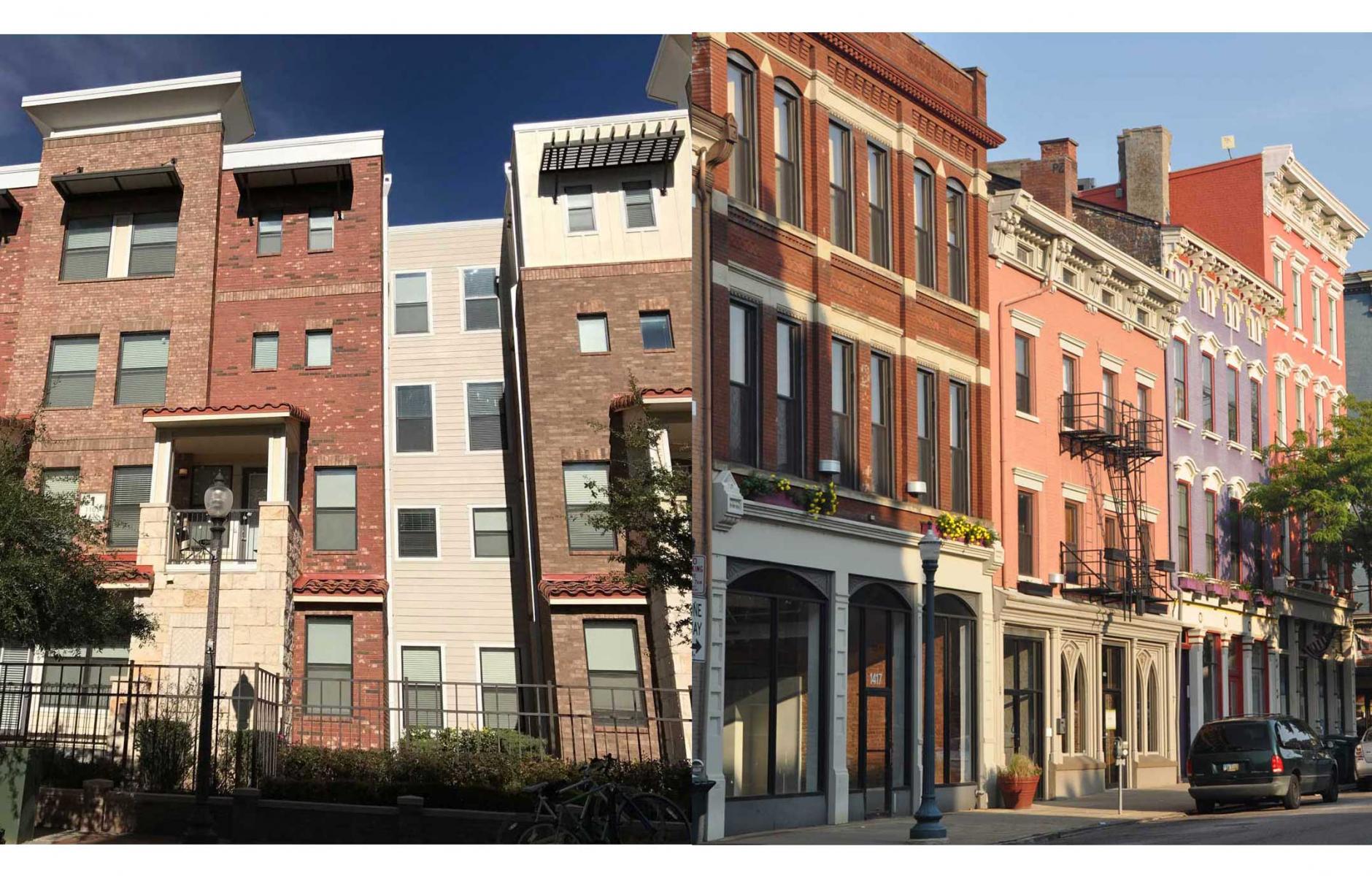
But there is another building type that has proliferated in more urban sites, which in many ways reflects the same questionable goal—attempting to create complexity at the architectural scale in absence of complexity or context at the urban scale. We can call this building/development type, the “McMain Street.” Like the McMansion that attempts to mimic the complex roof massing of an entire French village in a single building, the McMain Street attempts to mimic the fine-grained, vertically proportioned facades of the traditional American Main Street—all in a single building. And, more often than not, like the McMansion, the end result appears contrived and inauthentic. The facades lack the variety in design and detail that occurs naturally over time when multiple architects and builders develop a streetscape, one building at a time. With the McMain Street, we are left with a cartoon version of the traditional Main Street.

The phenomenon of the McMain Street is not limited to traditional architecture alone. Many modern buildings, especially multi-family buildings, go out of their way to add artificial complexity to the façade by pushing and pulling planes (in all directions), and arbitrarily changing materials. No doubt that we urban planners (who write design codes) have brought some of this on ourselves with our well-intentioned goal of maintaining the fine-grained character of the traditional street, but in most cases, architects are not up to the task or are pushed too far. It would be better to focus design and construction budgets on better quality detailing and less on the number of façade modules that can incorporated into one blockface.

McMain Street buildings pose other problems with cost and constructability. The projecting and receding planes, and multiple changes in materials needlessly add to the construction cost. Further, they compromise the integrity of the building envelope by both increasing the number of joints between facade materials and by overly complicating the roof flashing details which are prone to leaks.
But if you must …
This is not to say that there aren’t times when it is desirable to create the illusion of multiple buildings within a single structure. Many new mixed-use developments today are populated with buildings that occupy the entire block, or even multiple blocks. Therefore, some variation in the façade treatments may be desired. When I asked Andres Duany about his approach, he replied that the most important design tool for breaking up a long façade is to alter the height of the roof eave or parapet—instead of projecting in and out with the vertical wall plane. The following diagrams and images illustrate:


Or better, do it the traditional way…
Now, if you really want to create a more fine-grained blockface, plat the lots in smaller increments. This will allow small businesses and developers to buy and develop smaller buildings, while other lots may be re-consolidated for hotels, banks and office buildings. Much of Manhattan was developed on 20- 25-foot wide lots[1], many of which were joined together in successional development as the city grew. But the fine-grained complexity is still evident in many New York streets. The primary obstacle to creating smaller urban lots is the accommodation of parking. This is yet another reason that the parking supply should be de-coupled from the building/lot use and treated as part of the shared infrastructure (if provided at all).

In some cases, where it may not be feasible to plat small lots, buildings can be successfully designed as single compositions. New York, Paris, and London are full of handsome buildings that extend the full length of the block. Often, it is the storefronts at the sidewalk level that provide the variety and visual interest while the elevation above is more static and composed.
So, don’t let your Main Street—or any street—turn in to a cartoon version of Main Street! Planners and designers that want to preserve—or create—the character of the traditional Main Street should be more attentive as to the way this goal is achieved. Consider these tips:
- Whenever possible, develop with smaller lot increments (consider de-coupling parking to assist in this).
- If small increments are not possible, show restraint in the number of breaks and the way they are articulated (more up and down, and less in and out).
- Let hotels, banks, and other larger building types be expressed as single buildings with thoughtfully composed facades that more honestly reflect the true nature of the building type.
- Keep in mind that facade designs that are viewed only in 2-dimensional elevation form can be deceptively complex when viewed in 3-dimensions from the angle of the street and sidewalk.
Postsript: A search for the term “McMain Street” turned up a similar definition in the Urban Dictionary as follows: “A new centrally planned shopping mall designed to look like a small town center but filled with big corporate chains.” In this article, the term is applied to any building that attempts to mimic multiple buildings within the structure of a single building.
[1]“Notes on 19thCentury Lot Sizes” by Richard Howe, appearing in the blog “Gotham”, 09/15/2012


